

This is still a work in progress. This is the complete recipe, but more graphics will be added to help clarify some information. Optical Illusion…

Create a Pyramid or Tetrahedron in Apple Motion This article was the original response to the asked topic on Apple Support Communities which moderators deemed…

Perfect Character Write On with Motion (Mask Tracing Technique) To create a custom character write on effect that looks as if the typographic strokes appear…
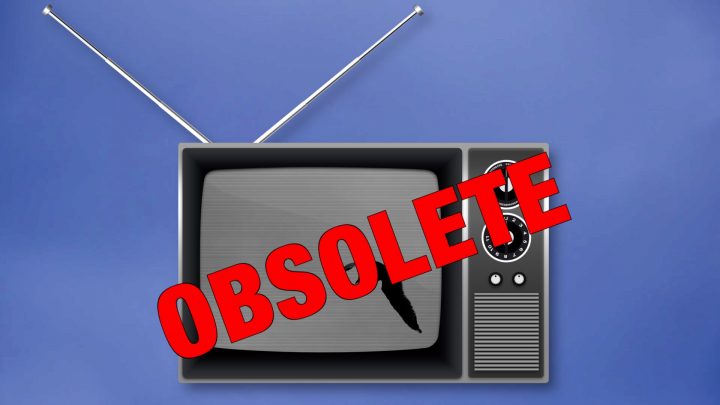
Fix Fractional Frame Rates (NTSC) in Motion Templates In the past year, I have come to the realization that NTSC (fractional frame rates) are obsolete.…

Word replacement animation without keyframes! Creating a word replacement animation in Final Cut Pro is actually easier than creating it in Motion. For one thing,…
About Fractional Frame Rates – Originally posted on Apple Support Communities Aug. 2, 2020 [Ascending soap box]I’d like to take this opportunity to make a…

Installation FAQ – Installing Templates for Final Cut Pro X Installing templates can be a little daunting the first time you are faced with the…

A Liquid Fill Animated Texture for Titles/Text This was a (too long) response for Apple Support Communities, so I posted it here. Ok – Animated…

Flipping Tiles I liked this video:https://youtu.be/HIGNWxfZs8oI appreciate any work done in 3D in Motion with text. That takes dedication.I have often said that there is…

Cartooner – 8 years along I deeply appreciate the free clips from Pond5; the quality and variety. They allow me an invaluable resource for effects…
This is a reply to an Apple Support Communities question FCPX/Motion and YouTube — upload practices YouTube will accept just about anything you throw at…

Building an Analog Clock In this simplified tutorial, we will be building an analog clock that can be used in Final Cut Pro. Build Concept:…

OSCs. OnScreen Controls. Before FCPX 10.0.6 (10/23/2012), using OSCs in a Title with Text was not a problem. As long as there was access to…

Legacy codecs will be abandoned in the next version of MacOS. Here is a list of codecs that will lose support.

You do not need a Motion Template for this effect! Scene: You have a green screen clip and you want to replace not only the…
Installing Plugins for Final Cut Pro X Effects (also known as Templates or Plugins) need to be “installed” in a very specific location. Inside the…
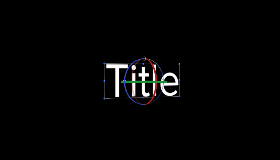
Designing fonts for 3D Making 3D easy Apple Motion and Final Cut Pro X Most fonts used for text behave in a specific manner. Each…
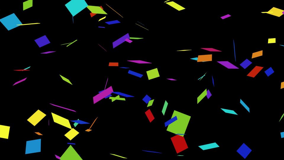
Making Confetti: an Apple Motion tutorial [Note: this is a response I gave a questioner recently on Apple’s Support Communities Motion forum.] Little bits of…

FCPX/Motion Template Compatibility Guide …and how to backdate a template to work in older versions Whether you need to “backdate” a template to an older…

Change Project Frame Rates in FCPX the Easy Way? Change FCPX project frame rates: Edit the XML file I have changed the frame rate of…
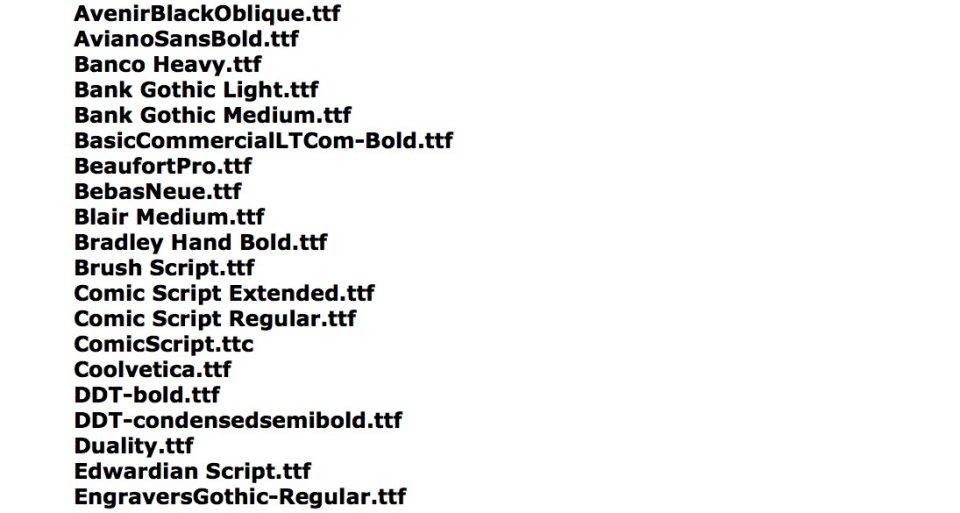
Fonts available inside Final Cut Pro X There are 72 fonts in 53 families inside the Final Cut Pro X application (and in Motion as…

3D models in Apple Motion are essentially text. True 3D is only available to text objects and in order to create a model, the parts…

Introducing a new FCPX effect Comic Book SC Literally years in the making. I’ve been after this effect for a long time. I finally had…
A Simple Trick With FCPX Titles Rotating Title text in FCPX You will need FCPX 10.2.x in order to make use of this tip.[ QuickTools…