Menu Close

Designing fonts for 3D

Making 3D easy

Apple Motion and Final Cut Pro X

Most fonts used for text behave in a specific manner. Each character glyph has its own “metrics”: width, height, position relative to the “base point” (the intersection of the vertical line passing through the insertion point and the baseline reference); there’s a bounding box, and several other aspects (e.g., x-height, m-width, and kerning). These measurements and dimensions have a purpose in placing the glyphs in response to input devices such as a keyboard (real or virtual) and designed to emulate real world typesetting. The most important aspect is that one character is drawn at an insertion point, then the insertion point is advanced by the character’s width for the next character to be added.

Designing fonts for 3D modeling is different. It is no longer important to advance the insertion point by any measurement, and in fact, it is more important that various glyphs stay aligned on a specific point.

Fonts designed for this purpose have zero-width characters. What that means is, you can add a character of a specific shape, then duplicate that character and replace the character with another glyph and it will automatically be exactly aligned with the first character. (This duplication becomes important when the two or more glyphs require different features like color, weight, edges and any other available feature.) No matter how many of these zero-width characters are placed, they are always aligned to each other as a part of the model, or, like a jigsaw puzzle, they all have the exact same center point. Multiple characters can be placed together in a single text object and they will align to create an image.

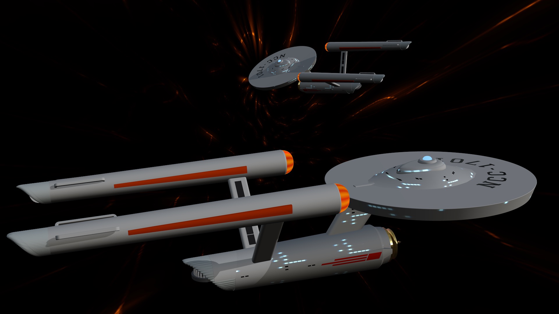
As an example: the Olympic Rings font. The Olympic Games symbol is five linked rings. In any other font, if you were to take the bullet character (Option-8) as the circle source, you would have to deal with the font metrics of the font you chose. With the Olympic Rings font, you can simply type “34567” and the five separate rings will automatically, perfectly, align to form the logo. Convenient!

Does that mean you can’t or shouldn’t simply use a bullet character? No.

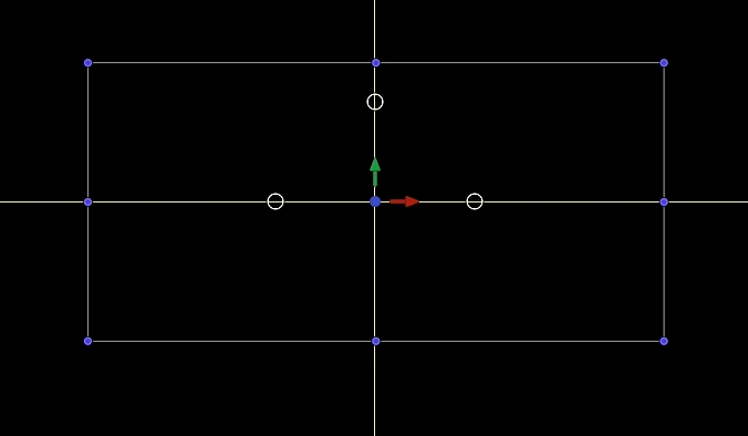
There is a feature in Motion 3D Text you may not be aware of — that of the bounding box. When text is selected and overlays are turned on, Motion draws a box with control points on the corners and midpoints around the text, taking into account the distance from the insertion point, the character’s typographic width, its ascent and descent. When you convert the text to 3D Text, that bounding box snaps to the actual tangent edges of the glyph (or group of glyphs that make up the text). It is possible to use guidelines to find the center of the text by aligning the midpoints of the bounding box (of 3D Text) to any set of guidelines.

Below shows the difference between the characters “34567” typed for Olympic Rings, a font designed for 3D “modeling” where glyphs are designed to a specific point in space and glyph placements are related to each other and a standard typeface where character spacing advances the insertion point of the next glyph. For Olympic Rings, it does not matter which order of characters you type (except if you think about it in terms of “stacking” the characters upon each other!)

Font designed for 3D

Note: not all characters designed in these specialized fonts are zero-width designed to match placements of other related characters. Also note the bounding box of the olympic rings “text” and how the control points line up with the onscreen guides and how the bounding box makes contact with the tangent edges of the character group.

For Olympic Rings: there are two sets of related characters. The first is the linked rings. The other is the Korean P-C symbols with respect to the position of “PyeongChang” text which was designed as a single character for this font.

In most cases, when seeking the glyphs used to build a model, it is best to keep Font Book open with the font in use selected. Set an insertion point in the canvas (or viewer in FCPX) then copy the character from Font Book and paste it to the text object. Both Motion and Final Cut will set the font correctly and apply the pasted character.

In general, it is recommended, when building “models” from fonts, that you center the text in the canvas so that all building occurs around the (0,0) position location. After you have completed assembly of the model, then move the object to its needed location in 3D space.

Zero-width characters make aligning various parts of a model the most simple it can be. The alternative is to manually align each character using either anchor points, or a combination of Center alignment and adjusting the baseline of a character until the bounding box center line control points exactly match a set of guidelines perpendicular to each other.

Previously mentioned was the technique of duplicating characters and pasting new replacement characters to build the model. In some instances, it is desired to “type” several characters  to form a complex shape all with the same 3D features applied across the entire text object. An example would be a video wall. Each character is a rectangle at a different location in the designed space. Adding a texture to the front face of a text object like this allows a drop zone to be used over the entire object, each separate character receiving its own piece of the drop zone without having to do anything more complicated of sophisticated to split up any media applied to the drop zone.


video wall feature
Every character shares the same features of the 3D Text. Object created by typing a "string" of characters.
Olympic Rings Font
Every character uses different features of 3D Text (for example: color). Every character is used individually, duplicated to maintain relative positioning and another, different, solo character pasted into the Text field.
Demo of Trekkie Starship font
Created from a specially designed font for this particular model.
starbase 1 trekkie starship font
This entire model uses a single character from a font designed for 3D (any font with a zero-width circle shape!)

So that’s an overview of the design considerations for creating specialized fonts for use in making 3D “models” in Final Cut Pro and/or Motion. The video wall example is much more conducive to the Final Cut Pro Title text environment – all characters used typed into one title text object. However, in general, it is recommended developing any of these designs in Motion for convenience. It is a much more versatile environment capable of building very complex designs!

Installation Instructions.

Keep up to date with Sight-Creations on Twitter.

A good place to see all of my effects as well as several tutorials and other demonstrations in use is on my YouTube channel.