
Perfect Character Write On with Motion (Mask Tracing Technique) To create a custom character write on effect that looks as if the typographic strokes appear…
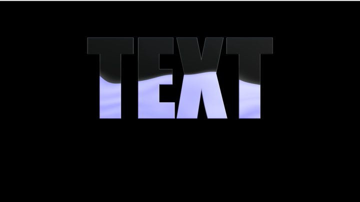
A Liquid Fill Animated Texture for Titles/Text This was a (too long) response for Apple Support Communities, so I posted it here. Ok – Animated…
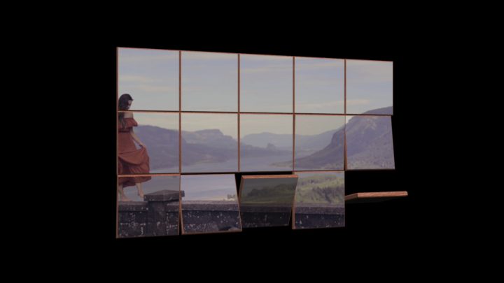
Flipping Tiles I liked this video:https://youtu.be/HIGNWxfZs8oI appreciate any work done in 3D in Motion with text. That takes dedication.I have often said that there is…

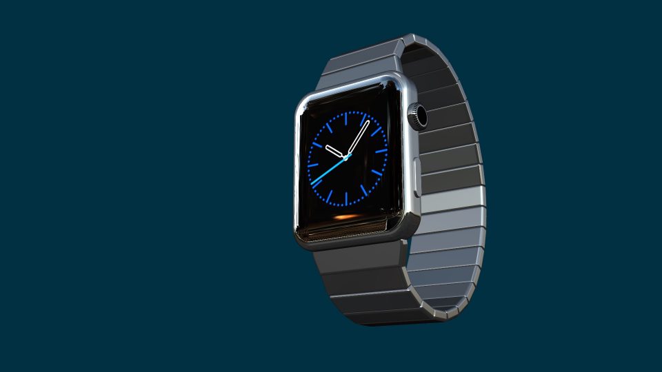
Building an Analog Clock In this simplified tutorial, we will be building an analog clock that can be used in Final Cut Pro. Build Concept:…
Designing fonts for 3D Making 3D easy Apple Motion and Final Cut Pro X Most fonts used for text behave in a specific manner. Each…
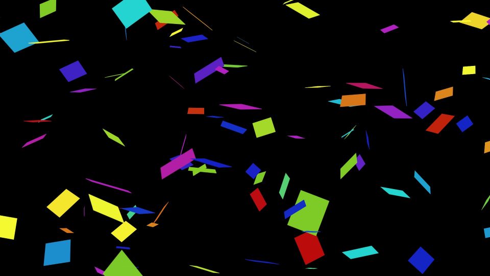
Making Confetti: an Apple Motion tutorial [Note: this is a response I gave a questioner recently on Apple’s Support Communities Motion forum.] Little bits of…
FCPX/Motion Template Compatibility Guide …and how to backdate a template to work in older versions Whether you need to “backdate” a template to an older…
Developed in August 2015 but never released. Why? Apple never made the San Francisco system font available to other applications (system only) and the…
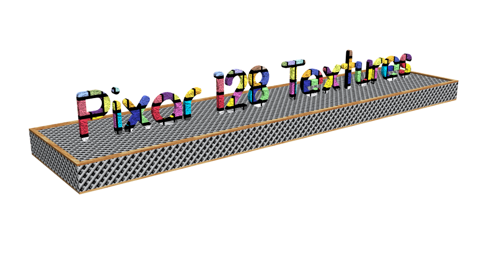
Pixar Textures – a must have for Motion 3D PixarTextures-toMotionContent ⬅︎ Download this Zip file and unzip it in the Finder. Original texture files can…