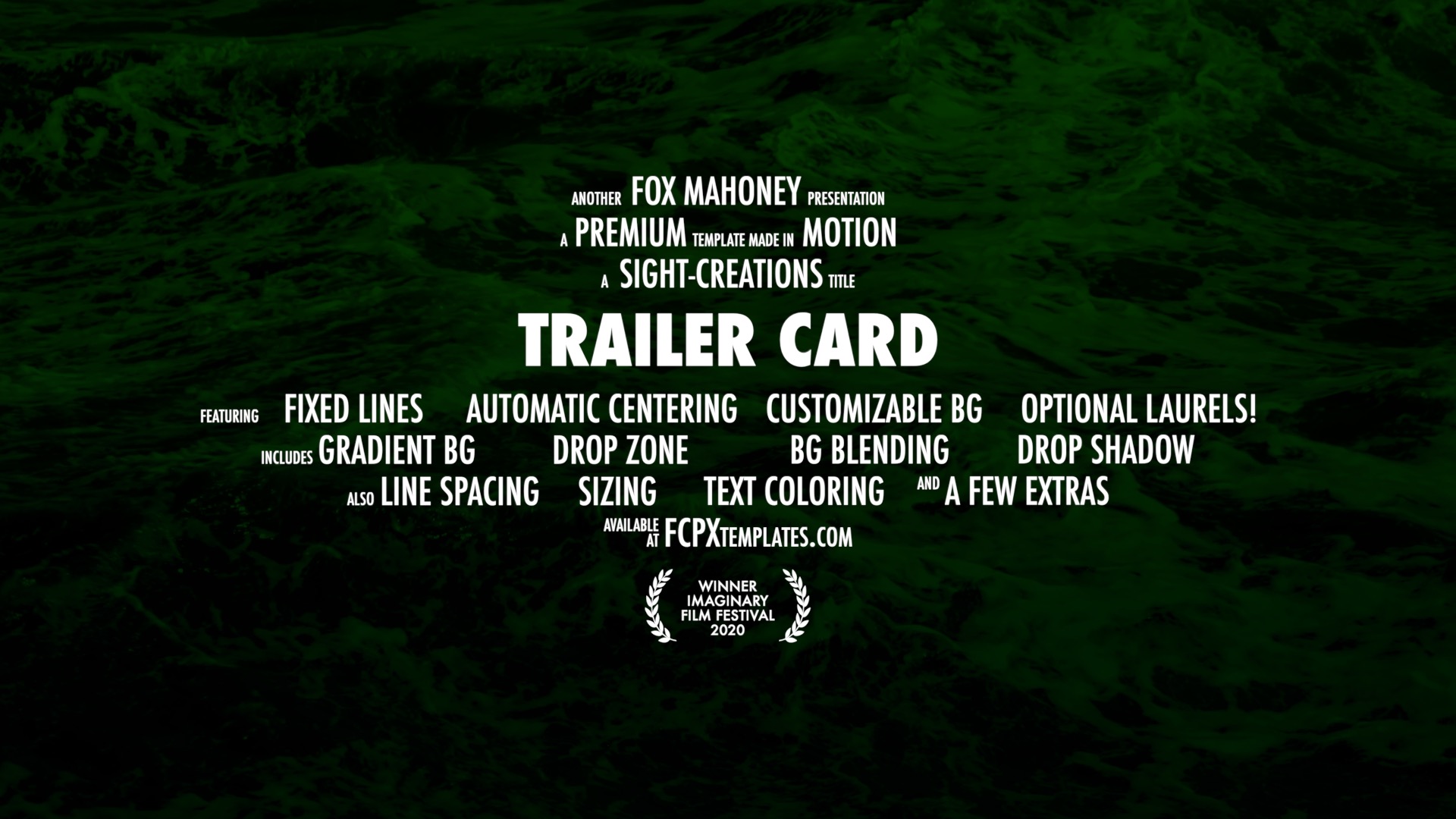
Trailer Card — As Easy As It Gets!
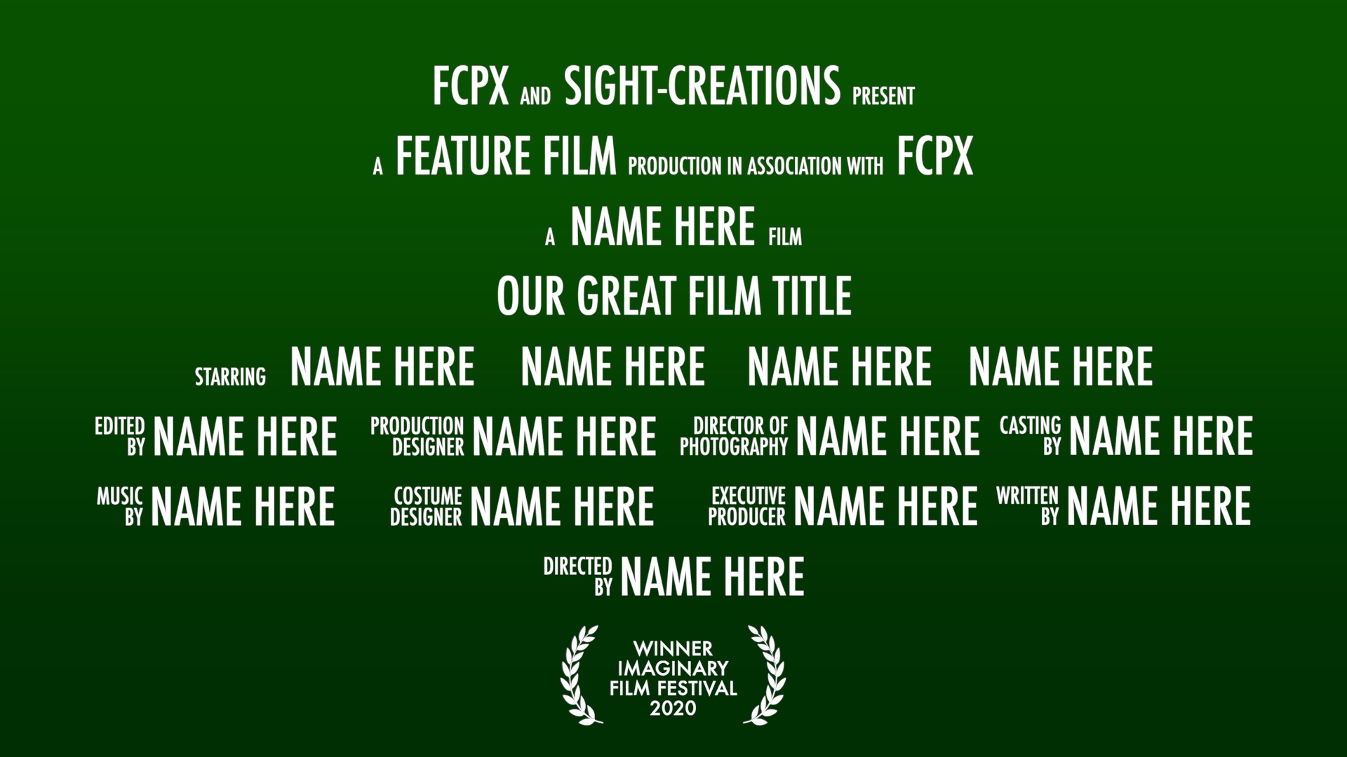
All text segments are separate from each other, this makes each text box its own onscreen control!
For quick editing, click on the text you want to change then use the Text Inspector to enter the text. This keeps the onscreen editor “off”. Otherwise, you will generally have to click out of the title and back in to reset selection.
All lines of text are fixed in vertical position — you cannot drag the text off their base line.
All lines are automatically centered based on the two outside text boxes. Simply click and drag left or right on text boxes to arrange your lines.
A master control for the overall Size of the card text.
A master control for Line Spacing.
A master control for vertical placement of texts.
Ability to change font and size of texts (usually *only* the movie title line). Includes ability to widen its allocated space and separate vertical offset within its space.
Gradient Color Background control.
Blend Modes (subset: Normal, Multiply, Color Burn, Overlay, Soft Light and Vivid Light).
Drop Zone – can be mixed with storyline media with opacity control.
Laurels are optional (but on by default). Laurels can be spread, scaled, and offset vertically and horizontally.
Drop Shadow controls.
Customizing
Although you may not copy and resell this template as your own, you are certainly free to make customizations in Motion for your own use if you have a mind to.
Trailer Card uses the Futura Medium Condensed font (it should be part of the base fonts available in Mac OS X.)
This template uses 37 separate Text objects that will need to be modified. Since you can make one change to one instance of text and drag and drop the changed parameter onto all the other text objects to change their matching parameter, that is easier than you might expect.
My main tip for modifications involve the small two line texts: If you change the font, you will need to adjust the Size, Line Spacing and Baseline to match the baseline and height of the larger words. Baseline is necessary to line up the bottom of the 2nd line to the same baseline as the single line texts. Make sure all of the text in the object is selected when making the settings for Line Spacing. Make sure the top of the first line is even with the top of the larger texts and the bottom of the second line matches the general base line of all the text on the line on which it exists.
I do not recommend trying to change the line structures.
You may opt to change some of the text entry fonts from within FCPX. Selecting a text object should open the Text Inspector in FCPX automatically.
About ZZSCRatings-Regular.ttf
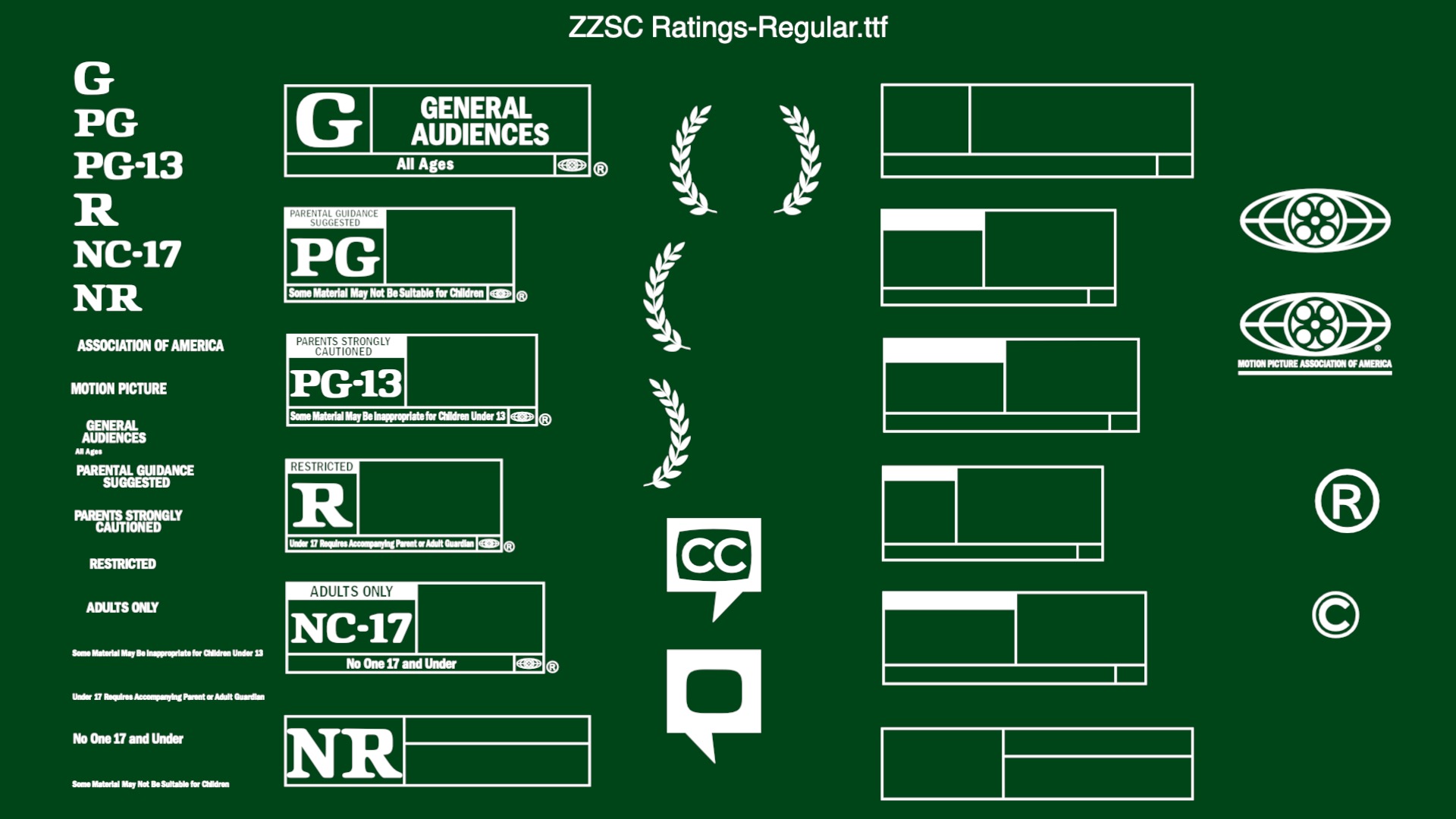
Trailer Card uses ZZSC Ratings font for the Laurel character pieces.
The image to the right displays all the available characters. All the lines of text, like “Adults Only” are single characters!
You may use this font for your own purposes. Please read the licensing agreement for terms of use. You can use Font Book to Copy and Paste characters into your documents (or Title effects in Final Cut Pro X).
Trailer Card demo:
*
Use the font very carefully. The font characters included form shapes that may be copyright and/or trademarked by the Motion Picture Association of America. (There are rules for use for some of the included symbols. See https://www.filmratings.com/downloads/rating_rules.pdf ARTICLE III Section 1 for specifics.)
Keep up to date with Sight-Creations on Twitter.
A good place to see all of my effects as well as several tutorials and other demonstrations in use is on my YouTube channel.

