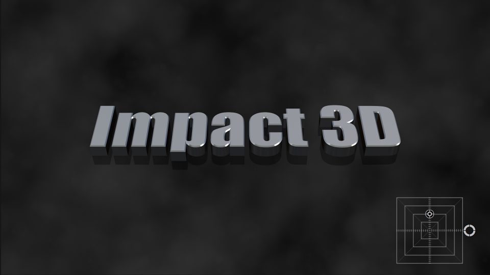
Tag: title

Sliding Thirds - fully Loaded

Sliding Thirds User Guide

Sliding Thirds User Guide

A title effect for FCPX

Description

This effect is for 16:9 media. You can use it for other aspect ratios, it simply will not look as good.

Sliding Thirds title is a simple yet powerful effect. Even though it is being referred to as an “effect”, it is actually a Title plugin for FCPX. And even though it is a “title”, no text has been provided for use. Sliding Thirds is very much like an adjustment layer you can apply to your storyline to provide animation support for any other kind of title you would like to apply. Its effect can be extended greatly by “stacking” instances of the Sliding Thirds title in your storyline. (Examples below demonstrate a “pyramid” stack, an “offset” stack, and “straight” stacks.) Directly stacking one upon another will double its effect.

The default setting is to have the left side panel animate into view for a little over 1 second (including the offsetting of the “canvas” if set). At the end of the title (about the last 1 second) the panel slides back off and any offset of the canvas is restored to its original position. The title can be as short as 2 seconds and 10 frames long or as long as your entire project. Panels are activated by checkbox option. It is allowed to not use any panels and only use the Horizontal and/or Vertical Slide to move what is on the canvas. Sliding Thirds can be used simply to “push” anything on the screen by up to one third of its dimension. Stack another Sliding Thirds on top and move everything another third, including whatever you add to the Sliding Thirds title underneath. Stack as many as you like to keep moving panels across the screen.

See the demo video (below) for a variety of effects than can be accomplished with this single simple title.

Horizontal/Vertical Slide: Values default to 0. Sliding left moves the screen (storyline) media to the left. Sliding right moves the screen media to the right. Values go to 100% with minus or positive indicating direction of movement (negative vertical is downward). A 100% offset will move the screen media just far enough so that the edge of the media will match the opposite edge of its corresponding panel (if used). Offset values of 0 will not move the screen/storyline media. The usual value of 50% will move the storyline media just far enough to maintain its center to the center of its new visual space between its panel and the outer edge of the video. This value may be keyframed to customize its appearance as well as to make adjustments when stacking Sliding Thirds. Keyframing can be used to override the built in animation timing. An example of this is demonstrated in the Demo video below.

Fill Color: The color used for all panels. There is no mix and matching colors for panels, they are all the same for one instance of Sliding Thirds.

Fill Opacity: Sets the transparency for all panels.

Use Left/Right/Top/Bottom Panel: Checkboxes allowing selection of which panel appears. They can all be used or none of them can be used. If you would like to build a “reveal” effect using only Horizontal/Vertical Slides, you must combine the Sliding Thirds title with a clip in a compound clip and place the media to be revealed below the compound clip in the storyline. Without using a compound clip, Sliding Thirds will move *everything* beneath it including clips beneath the storyline (but not audio!)

Drop Shadow: Typical drop shadow controls; should not need explanation.

Drop Zones: There is a drop zone for each panel. The drop zone is sized to exactly fit the panel it belongs to which will make media placement convenient: the center of the dropped media will always align with the center of the panel. Included with each drop zone is a Pan parameter which allows adjusting the positioning of the media within the panel; and a Scale parameter which normally will be used to “shrink” one of the dimensions to fit more of the view into the panel, e.g., scaling the X dimension to less than 100% to squeeze the media horizontally for Left/Right panels, or for shrinking the Y dimension to fit vertically into Top/Bottom panels.

Added recently:
Animate Intro/Outro: The animation only determines the appearance of the panels. Turned on, the panels will slide in. Otherwise they will instantly and continuously be “on” for the duration of the Sliding Thirds title in the storyline. Sometimes it might be useful to have the Outro turned off if you simply want to move a clip in one direction and not have it be returned to its original position (usually when stacking multiple Sliding Thirds…) It’s at the bottom of the parameter list to mostly be “out of the way” and there if you need it.

Parameters:

Sliding Thirds parameterList

Basics

Sliding Thirds consists of two parts: The sliding background panel and the storyline content. Storyline content means everything (media, generators, titles, or anything else you can add to your project) underneath the Sliding Thirds title instance. A Panel is a complex background widget consisting of a solid color and/or drop zone content.

Panels are designed basically as a solid color background for any other type of content you wish to add above the Sliding Thirds title. Panels may be any color. Panels may have any level of opacity, they can even be made invisible.

Drop Zones can contain anything. Media, other titles, other generators, and compound clips of any other combination of media, generators, titles, etc. Using Drop Zones that are filled with titles or other transparent background media still display the background color solid panel depending on your settings.  When using another title for any of the four drop zones available, you may create a title in your project anywhere in your project, then select the drop zone source well in Sliding Thirds and select your (temporary) title and Apply. Once the content is added to the drop zone you may delete it from the storyline or change your title to be reused in another drop zone. When you’re done with adding drop zone content, you may delete any item from the storyline that you created to place in the drop zone.

Drop Zones in Sliding Thirds are designed to have the aspect ratio of the panels on which they are applied. When designing titles or generators for adding to a drop zone, design for the center of the screen. The center relationship is maintained within the custom drop zones. You can offset and/or scale the drop zone media with the supplied parameters for each.

Use as a Reveal effect

Panels are optional. The left panel is on by default but may be turned off. The storyline media may be animated (up to 1/3 the screen in either direction per instance of Sliding Thirds [if stacking is used]). If all the Sliding Thirds titles are combined with media immediately below their instances into a compound clip, then any other media below the compound clip will remain stationary. Combining the animated compound with stationary media will create a reveal effect. This may also be used for basically any kind of media: to reveal a title or reveal another clip. Turning off the Animate Outro option with three stacked Sliding Thirds instances can be used as a slide transition.

“Fully Loaded”

One Slider Thirds title. The ice cream sundae clip is in the viewer and all four panels have their drop zones loaded. When the drop zones are empty only the panels are visible provided their opacity is enough to make them seen.

Upper and Lower Thirds are always dominant. When using color panels without drop shadows, it is possible to make L-shaped fill regions. When using Stacking (see below), for example for a 2/3 slide, Drop Shadow seams can be eliminated by applying a drop shadow only to the lowest instance.

Stacking

As stated, Sliding Thirds will move everything underneath its duration. You can add basic titles (or any other type of media) over the storyline and Sliding Thirds will gather it all up and slide it (by the Horizontal/Vertical Slide amount). In the example below, there is a Basic Title over the storyline video. About 1 second after its appearance, a Sliding Thirds “instance” is placed. The Basic Title text will slide with the storyline media as if it were part of the scene. If the Sliding Third has video in its drop zone, then that video will slide into view to “fill the gap”. When the Sliding Thirds instance ends, the media will slide back to its original position.

Stacking more than one Sliding Thirds will continue to slide media — including a Sliding thirds panel or drop zone that is underneath it. The maximum slide for each instance is 1/3 the screen. Two instances will slide 2/3s of the screen and so on. More than three instances will begin to slide panels off the screen at the other end — but they will slide back on when Sliding Thirds title ends over the instances below it. In the case of “Offset Stacking” as shown below, the returning media will “collapse” behind the last (topmost) instance until finished.

Sliding Thirds Offset Stacking

The above image shows the storyline section for the Demo: Offset Stacking section of the demo video.

Pyramid Stacking

In the example below, there is a Basic Title (“Demo Pyramid Stacking” from the Demo video) on top of the storyline. Four Sliding Thirds titles have been stacked and retimed to form a pyramid shape, followed by another Basic title on top. The top Basic title remains stationary throughout the animations. The Demo Pyramid Stacking title text at the bottom of the stack is animated four times – once for each Sliding Thirds title added and resulting with the Demo … text moving off the right side of the screen upon the exectution of the fourth stacked Sliding Thirds. In this arrangement, when the topmost Sliding Thirds ends, the entire screen (accumulated titles below it and the storyline) will reset back the same displacement amount. When the third Sliding Thirds ends, the screen resets back another third distance, etc. until the storyline is restored to its normal appearance.

Sliding Thirds Pyramid Stacking

The example below demonstrates the use of interim text titles under the Sliding Thirds. The green arrows show the positions of Sliding Thirds titles and the yellow arrows highlight the positions of Basic Text Titles used to label the entire accumulated scene beneath each text entry. The yellow circles illustrate where titles were “bladed” and their content changes, so as the animation begins resetting to the normal storyline appearance, the titling has been changed to extend the messaging.

This example is taken from the section of the Demo video below beginning with the waterfall and sliding up six times.

Pyramid with text added

Straight Stack

Add a Sliding Thirds title to the storyline and set the Horizontal or Vertical (or both) offsets to ±100. Hold down the Option key and drag upward to create a duplicate of the Sliding Thirds title. With snapping on, align the two titles together. Animation will now cover a 2/3 distance across the screen. Repeating this action will cover the screen with either panels, drop zones (in 1/3 sections) or, by making a compound clip, a full screen “reveal” effect with any other additional media placed anywhere below the compound clip.

Creating a Paneled Split Screen

Apply a Sliding Thirds title. Pick which panel to use and adjust its color. Leave Horizontal/Vertical Slides at 0. Option drag a copy immediately above the first one (which also duplicates color and panel choice). For the instance on top, set the Horizontal or Vertical Slide to 50%.  To the instance on the bottom, adjust the drop shadow if used (Blur = 0 and Opacity =100% will create a solid line). Apply your titling or other media content to the solid color background portion of the screen:

Of course: you still have plenty of options for customization!


Sliding Thirds is an extremely useful, easy, and quick utility to perform perfectly executed animations by thirds — no keyframing required. If you work with television advertisement, this tool is a must have.

Demo:

Installation Instructions.

Keep up to date with Sight-Creations on Twitter and Facebook.

short circuit is a glitch title effect by sight-creations and Short Circuit User Guide

Short Circuit User Guide

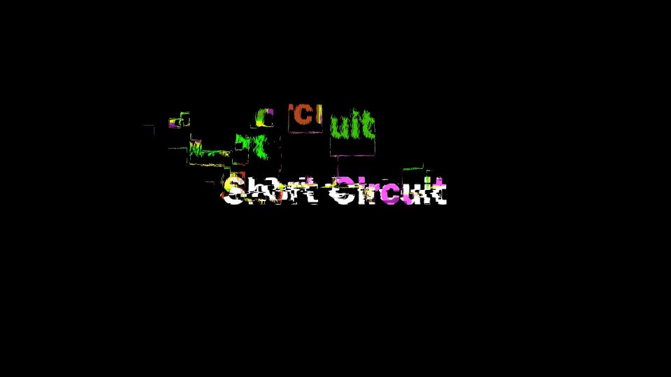
Short Circuit User Guide

by Sight-Creations

A Title for FCPX

There is an onscreen control (OSC) for convenient positioning on the screen. There is a Rotation parameter available just for fun.

Due to the way this effect was created, editing text on the screen is not allowed. You must change the text in the Text parameter in the Title inspector. All other controls for text (color, font, size, alignment, line spacing, tracking, etc) have been made available in the inspector for your convenience. The Collection parameter has been supplied so that if you use font collections in Font Book to organize your fonts, you can shorten the font list by selection your “favorite” collection first, then choose a font from that collection.

GLITCH PARAMETERS

Noise Smoothing
Noise has been added to this effect to create part of the texture. Noise Smoothing blurs (more like smears) the noise in a specific direction. The higher the amount, the smoother it will appear. Between 0 smoothing and about the default setting of 16, the smoothing will appear a little like a paint brush stroke. As the value is increased, the noise will be less apparent.

Noise Angle Mvmt
This parameter randomizes the direction of the “smearing”. At 0, the smearing is horizontal.

Glitch Coloring
This gradient can be customized to color the glitch effect. It uses luminance “mapping”. Darker shades of the Glitch pattern used will appear to be the color selected on the left side of the gradient. Lighter shades will map the right side of the gradient. You can use as many color tabs as you like. The colors of the gradient may also be animated. If you opt to animate color, make sure you have all the tabs of color you need for the entire animation. Adding tabs is easy: simply click the mouse in the “color bar” under the gradient bar and a new tab, containing the color clicked on will appear. (You can remove tabs by clicking and dragging them off the bar.) The gradient has a disclosure triangle to open it up for all of its available features. Since this is a luminance mapping, opacity tabs have no effect on the color used.

Glitch Color Over
On by default. Deselecting this option will have the actual text always “on top” of the effect. Its appearance will be affected by the Text color parameter. The glitch effect does not blend.

Horizontal Glitch Amount % / Vertical Glitch Amount %
These parameters determine how spread out the effect becomes. Near 0 will keep the glitches close to the text. The higher the percent, the more of the screen territory will become involved in the effect.

Short Circuit Title parameters

Glitch Amout % > Frequency
This parameter increases the amount of change in the glitching based on the direction percentage set.

Division Lengths
The glitching effect is “notched” in on/off states. The “notches” are generally different lengths of time (depending on the Random Seed parameter). Higher numbers for Division Lengths means that glitching will happen for longer periods of time (still very short — but relatively shorter or longer depending on this setting).

Frequency
This parameter will set, in general, how many glitches occur over the 10 second default length of this title. Setting or animating to 0 for this parameter *should* turn the glitching off. A setting of 1 will create a circumstance where the glitching is nearly constant. A setting of 2 will be approximately half and half, etc. A setting of 8 should provide 8 on/off cycles.

This title is designed to loop its animation. This method allows this title to keep the exact timing you achieve with your chosen effect no matter how long you make the title in the storyline.

All of this will depend on the setting of the Random Seed which changes everything. The timing of this effect is extremely flexible and its random mixing of time notches is part of its appeal making it seem more “natural”.

GLITCH SHAPING PARAMETERS

The glitch effect is determined by a pattern created in Motion and almost infinitely variable even though it is restricted so that will not become over-taxing to Final Cut’s rendering engine. The pattern is comprised of shapes that you can randomly size.

Pattern H Density / Pattern V Density
These parameters determine how many shapes are “crowded” in the horizontal and vertical space of the “texture”. (More below).

Scale X / Scale Y
Use these parameters to redefine the basic shape used in the texture.

Scale Rand.
This parameter will randomly change the redefined basic shape by the amount selected.

Randomize S… (Scaling)
This randomizing parameter will re-randomize the scaling of all the shapes in the pattern

Pattern Shuffle
This parameter will simply rearrange all the shapes within the pattern.

More on Glitch Shaping Parameters
It is possible to remove all shapes. At this point, the Glitching will simply be Noise (and the base text combined). By manipulating these parameters, you can design a multitude of different glitching effects (all in one title!)

TIP
When you find a pattern you really like, select the title in the storyline and save as a Compound Clip (set up an Event to collect saved favorite titles!)

Demo:

INSTALLATION
If you need help installing this title effect, please refer to this document:
https://fcpxtemplates.com/installing-plugins-for-fcpx (there are links to an outline and step-by-step video if you need to see the process.)

Keep up to date with Sight-Creations on Twitter and Facebook.

Vegas Baby demo

Vegas Baby Title

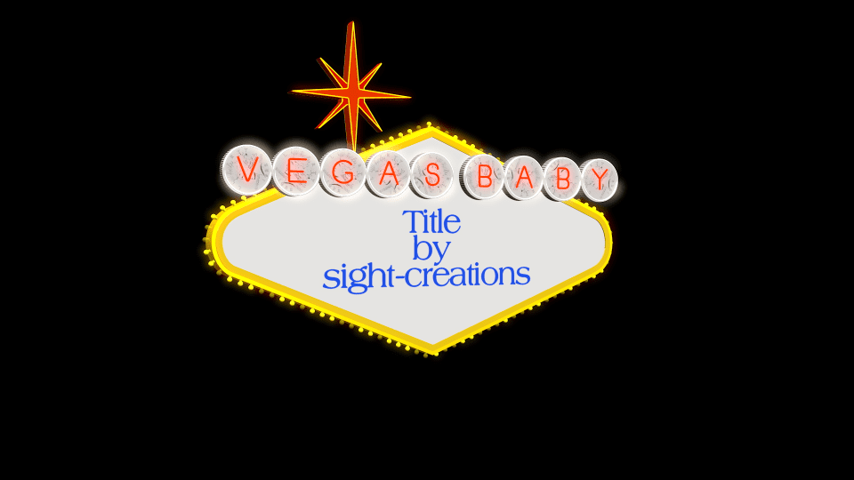
Vegas Baby User Guide

A Title for FCPX

The iconic Las Vegas Welcome sign was designed in 1959 by Betty Willis. It is in the style of “Googie Architecture” (FYI). She gave the design as a gift to the City of Las Vegas without copyright. It is in the public domain.

Vegas Baby is a 3D Text title for Final Cut Pro. It requires FCPX 10.3.4 or better, a video card with a minimum of 1GB of vRAM, and the installation of a specialized font (ZZSCVegasBaby-Regular.ttf) responsible for the “neon” letters and the sign shapes (it will be necessary to restart FCPX after installation of the font).

Vegas Baby is a complex effect with flashing lights and special textures (coin faces) and animations on two separate sides. Expect long render times. When dealing with the title in the FCPX storyline, it is best to set the View > Quality to Better Performance. Since Vegas Baby performs “reasonably well” using Better Performance, it was deemed eligible to be released. Please be patient with it!

Vegas Baby features an easily customizable “banner” (circled letters) and drop zone panels on the front and back sides. Separate titling for the front and back panels. Titling and drop zones can be combined. Complex text formatting will need to be handled via imported image/video or by creating compound clips in the storyline. An example would be any text message with more than one font used.

A 3D OSC (on-screen control) has been applied to this effect. For this reason, none of the text in the title is editable in the viewer but text boxes have been added to the Inspector to make text changes. To use the OSC simply single-click on the Vegas Baby panel and wait about 1 second. A Rectangular outline will appear and a 3D directional control will appear near the center of the rectangle region. It’s a hack… but it works. You can use the 3D control to keyframe rotation, but positioning via keyframe will have to be manually done with the parameter values in the Inspector. [Note: the OSC is a text character itself which is editable in FCPX – ignore anything you see in the Text Inspector as it pertains to this character used for the 3D onscreen control. If you accidentally change the character, its default is the character zero (‘0’) and its size is 856.0 if you find you need to manually reset these values.]

The Coin Features (Banner) Section

The neon letters in the circle shapes at the top of the panel are considered the banner. As with the real sign, the front surface of the circular regions have the pattern of a 1922 “Peace” silver dollar. The “coins” are not “regular” and each surface of the original WELCOME sign have different rotational orientations for the coins. This title has a feature to force them to align if you so choose — set the Coin Rot. Variance to 0% and set the Coin Rotation to orient the faces to the same angles across the characters of the banner.

Vegas Baby Banner detail

In the Circle Text entry, you can enter anything from deleting the text (to completely remove the circled characters) to whatever you think can fit on a single line and still look good as a sign ;).  Whatever you enter will apply the characters (only a-z lowercase [and space] are supported), the coin circles and the rim “ring” lights. A space character will add a small separation between letters.

There is a fundmental “lighting” structure to this 3D model. Sometimes expected colors may seem darker (or lighter) than the values provided in the inspector. Make visual adjustments in the Viewer and don’t rely so heavily on the numerical values. For times when even the “brightest” color is not bright enough: the numerical values of the RGB color can be adjusted to greater and less than the absolutes provided by the corresponding sliders. Click on the individual numerical values for the R, G, and B elements and drag up to go beyond 1.0 and drag down to go below 0 (towards -1).

Due to the design of the template, text is not editable in the viewer. For each panel, there is only an option for one font. If you need more complex textual design (more  than one font, or font and graphics) create a compound clip in the storyline from titles and other graphics and add the compound clip to the drop zone for that panel. You can delete the compound clip from the storyline immediately after adding it to the template.

Flashing light animations will be affected by lengthening or shortening the time of the Vegas Baby title. Longer times will slow it down; shorter times will speed it up. Recommended length in storyline is about 5 – 15 seconds (10 is default). Ten seconds is a good length of time to leave this title active to give the viewer time to take in the whole effect.

The rest is fairly typical.

Published Paramters

ANIMATION CONTROL

Position — It is possible to position this template in the view with an OSC (described above). However, if you want to keyframe motion, you cannot use the OSC to make position changes. Use these parameters “manually” for keyframing. Another benefit of these parameters: no matter what rotational orientation you have set for the template, these parameters will move it in tradition X, Y & Z axes relative to the Viewer. Using the OSC: rotation changes the XYZ axis orientation as well. Position parameters override that orientation.

Rotation — Unlike Position, Rotation can be keyframed using the OSC. These parameters do not override those set in the Viewer.

Hide Stand — The blue stand can be removed from the scene to reduce the template to the basic sign.

Glow Amount — This is set to 3 by default. In general, this setting is likely the best setting. However, you can raise this value to create more “light halos” or turn it off altogether.

COIN FEATURES

Circle Text — This is where you enter the text for the “banner” section. Only lowercase alphabetic characters (a-z) are used for the effect. Other characters will not provide the correct visual effect.

Text Color — Keep in mind that this is supposed to be a neon-like light. You will want to adjust this color to a value that will be enhanced by the glow effect.

Circle BG Color — By default, this is set to 90% white. You can set this, and all colors in this template to “supercolors” (element values greater than 1.0 or less than 0.0).

Coin Face Intensity — This determines how dark the “marks” are that create the coin “face”. Setting this to 0 will fade the coin face out completely creating a solid color background for the neon characters.  Setting this value to maximum intensity will help “punch through” the pattern if you adjust the Coin BG Color somewhat darker.

Coin Rotation — The “real” Las Vegas Welcome sign has 1922 Peace dollars painted on the backgrounds at varying angles of rotation.  This is set at 360 (straight up) to help with the Variance (see below). When Variance is set to zero, all the coins are rotated to this value.

Coin Rot. Variance The variation from one coin to the next for the rotation. When Coin Rotation is 0, this has no effect. When Coin Rotation is non-zero, this parameter will randomize the rotation between 0 and the Coin Rotation value.

Var. Random… This is the Random Seed generator for the Variance. Click the “circle arrows” to generate a new “seed” value and change how the coins are varied.

Ring Light Color Each character in the banner also has a “ring light” — another “neon” (or florescent) type light around the rim of the “coin” background. Use this parameter to change its color (default is white).

Emit Intensity This parameter will change the brightness of the Ring Light color.

FRONT SIDE/BACK SIDE

(each section has identical parameters, both of which will be outlined in this section.

Front (Back) Text — Use this text box to enter the text you want to appear on the sign panel. This can be used in conjunction with a drop zone (always appears on top).

Collection — Font Book “collections” are supported with this template. If you manage your fonts with collections, you can set the collection here. For example, you have a collection of just “script” fonts, you can set this parameter to your scripts collection then search for the script font from that collection you are looking for without having to navigate a font menu that might be hundreds of fonts long.

Font — Same as from the Title Inspector provided here for your convenience.

Size — Same as from the Title Inspector provided here for your convenience.

Color — Same as from the Title Inspector provided here for your convenience.

Weight — This is a feature of 3D text. You can use this parameter to change the thickness of characters, make them more bold or more thin. Best practice: hold the Option key down while dragging the numeric value for more refined alteration.

Line Spacing — Same as from the Title Inspector provided here for your convenience.

Tracking — Same as from the Title Inspector provided here for your convenience.

Baseline — Same as from the Title Inspector provided here for your convenience. Use this parameter to help vertically align the text where you want it to appear.

Drop Zone — Optional. Drop Zones are pre-loaded with a transparent PNG so that the typical drop zone “symbol” does not appear.

Pan — Use the X and Y parameters to adjust the alignment of the image in the panel.

Scale — Use this parameter to size the media to fit within the panel.

Front (Back) Brightness — As mentioned above, this is a 3D model and lighting is affected by things like angle of rotation. You can use this parameter to help override a “too shadowy” look, or tone it down if it’s too bright.

Installation Instructions.

Keep up to date with Sight-Creations on Twitter and Facebook.

A good place to see all of my effects as well as several tutorials and other demonstrations in use is on my YouTube channel.

Artistic Magnifier

Artistic Magnifier User Guide

Artistic Magnifier

A Title for FCPX

User Guide

Originally designed as a utility magnifier for tutorials and such, it turns out there are interesting visual side effects that make this effect usable anywhere!

This effect was designed as a Title which allows any other object positioned below the title attached to the storyline, including text. If you’re okay with a little softness in the text (which is also a nice effect occasionally), this effect can be used to “transition” text with a slight drift and marvelous fade.

This effect was designed so that the scaled media used in the magnified view region maintains an “edge alignment” proportional to the position of the magnified region within the view frame of the video. What that means is: when you align the edge of the magnifier region with any edge of the view frame, the scaled media also aligns with that edge. The magnifier is designed not to go beyond the view frame edge, it will always be contained within the view frame. This technique means that when the magnifier region moves away from the center of the screen, the scaled media also moves in the opposite direction. It is a very nice effect — a beautiful difference in parallax view of the scene and gives a subtle sense of “3D-ness” to the scene.

In the diagram below, the Magnifier region is moving along the direction of the green arrow and as it moves, the Scaled Media is moving toward the border of the Drop Zone/Storyline frame boundary in the direction of the red arrow, synchronized to coincide at the edges of the frame boundary. The Scale value determines how much movement is perceptible.

Artisitc Magnifier Diagram
Artisitc Magnifier Diagram How scaled media moves with respect to the magnifier

Parameters:

This effect has a single OSC (onscreen control) to assist in positioning in the viewer.  The position can be keyframed.

Width/Height: Due to the nature of the design for this effect, it was necessary to limit the width and height to only 1280 wide by 720 high. If you’d like to see how this was done, you can go into the Motion template in Motion and dig it out. It did require working a spreadsheet in Numbers to make the calculations necessary and for values beyond the 1280 horizontal and 1080 vertical, there was not enough room to add the number of control points necessary to handle the exponential expansion of values to make alignment for a larger region possible.  Maybe, someday, Apple will add a way to perform that kind of math automatically and this project will be updated. It is not necessary to keep these values proportional to each other. Within the bounds of the maxWidth and maxHeight, any size can be created (even 0 by 0) and keyframed for effect.

Scale: Range from 0% to 400%; default is 200% (or 2X). May be keyframed for effect. All scale values work with the math used for the region/scaled media edge alignments. However, when going smaller than 100%, it will be necessary to resize the width and height parameters if an outline boundary is desired.

Roundness: The magnifier region may have rounded corners. Rounding can also be used to create a more circular effect (although you may have trouble obtaining a “perfect circle”).

Border Color: keyframable value can be animated to change color over life, or simply be set for the life of the effect.

Border Opacity: keyframable value can be animated to fade in/out the border.

Border Width: keyframable value can be animated to adjust the weight of the boarder. The center of the border is the edge of the magnifier region. Using large values will obscure edge pixels.

First/Last Point Offsets: These parameters can be used to offset the beginning and end where the border is drawn around the region. These can be keyframed to create an (eye-catching) animation, typically drawing the box, or used to create an animated arrow (see the Outline Start and End Caps below).

Corner Style: when the region is set up as an unrounded rectangle and outlined with a line wider than 1 pixel, the corner style can be set to Square, Round or Bevel (which will create a 45° angle “cut” on the corners).

Outline Start/End Cap— There are four options: None (similar to Square), Square, Round, Bevel and Arrow. None ends at the actual control (corner) point whereas Square represents the center of a “fill” of a square that is “Width x Width”. Bevel cuts two 45° angles on the end and Arrow applies an arrow head. (Arrow size controls were not included with this effect: they were deemed superfluous for the most part).

Feather Edge/Falloff: These controls can be used to control a blurred and mixed edge between the magnifier region and the underlying media. There are values available beyond the slider, so click and drag the values up/down to create a larger feather.

Bg Overlay Color/Opacity: This effect includes a method of darkening the area outside the magnifier region, for effect. Color is black by default but may be set to any value and animated over time. Opacity is also a keyframable value that can be animated to fade in/out the color overlay.

AUTO ANIMATION section:

These parameters deal with transitioning the magnification effect.

Fade In Time: the number of frames to fade up from 0 to 100% opacity. Timing may be affected by stretching the effect’s timing in the storyline.

Fade Out Time: the number of frames to fade out from 100% to 0% opacity. Timing may be affected by stretching the effect’s timing in the storyline.

Start Offset: the number of frames before starting the Fade In.

End Offset: the number of frames before the end where the Fade Out ends.

These parameters controlling the fade of only the magnifier region allows animating other features before (and/or after) these Fades are applied.

Demo:

Keep up to date with Sight-Creations on Twitter and Facebook.

Use 3D Titles for the 3D orientation onscreen control

A Simple Trick with FCPX Titles

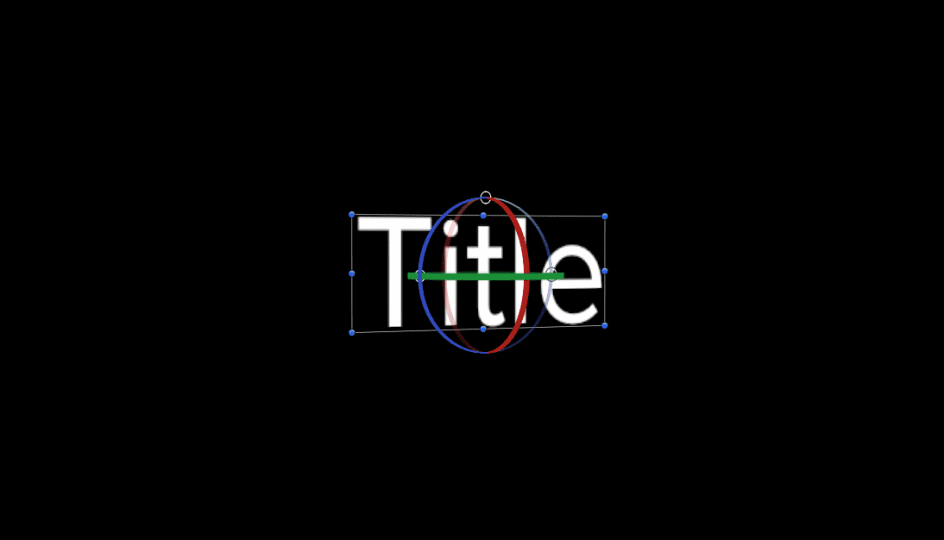
A Simple Trick With FCPX Titles

Rotating Title text in FCPX

You will need FCPX 10.2.x in order to make use of this tip.

[ QuickTools has been upgraded, enhanced and greatly expanded by SC KeyFX! ]

I’ve created dozens (if not more than 100) titles for FCPX, but for my own personal use, 95% or more of the time I just simply add a Basic Title to my storyline as needed. If you’re familiar with Basic Title (and you should be!) you’ll know that there are no parameters available. One of the features of Basic Title is that the Title Background is absent. This Title Background is a placeholder used in developing Titles in Apple Motion to represent the content of the storyline in FCPX (or more accurately, the content of *everything* video/image related beneath the title in the storyline). Something to keep in mind as I’ll get back to that later.

The behavior of Basic Title in the storyline is that you can click on the text in the canvas and drag it around to place it in the scene. You cannot keyframe the motion to create an animation in this way. Keyframing animation is not the important point of this story, it’s just a point of note.

What this article is about is a “trick” to be able to *rotate* the text in 3D space to arrange it in the scene. It should work in any Title or Generator that includes editable text in the canvas.

With the Title selected in the storyline, click on the Text tab of the Inspector. Activate 3D Text (you can turn it back off afterwards!)


3D Text - not selected
3D Text Select

Go back into the canvas and mouse over the text area. You should see an outline appear:

Title Selection

Click *once* inside the rectangle. You should see a 3D control appear:

3D Title OSCs

Clicking and dragging inside the circles will allow you to rotate the text in 3D space. The top circle is the X-axis rotation (a red “great circle” will appear when activated). The left circle will be the Y-axis rotation (its great circle is green). The right circle will be the Z-axis rotation (and its great circle is blue).

3D Title Control

If you hold down the command and option keys, you can coax all the great circles to appear and stay on allowing a floating rotation control with the mouse in all directions at once.

You may not like or need a 3D look to the text so you can turn 3D Text back off to restore the 2D text and the orientation will remain as in the example frame below. This is a great tool to help align text along perspective planes inside video. It’s not perfect but seems to be convincing enough most of the time. To make it work better — if you have Motion — you could publish the Camera: Angle of View parameter and possibly the Camera: Distance (Position.Z) to emphasize parallax views.

Integrating Titles Into the Scene

The second part of this article is about taking the technique to another level, that have having it appear integrated into the scene — to have action move in front of the text. Take a look at the examples in this video:

QuickMask is part of the QuickTools Effects sold on this site and on my store on Creative Market. The mask only works in this fashion on Titles that have their Title Background placeholder disabled. You can download a *FREE* Basic Title with Parameters title/template here (http://sight-creations.com/free_stuff/sc_Title_with_Params.zip) which will allow you to animate the title in the canvas without having to use the Transform parameters for the entire “layer.” You are able to keyframe rotation using the onscreen 3D controls, and although the position parameters respond to onscreen control movement, you must manually keyframe the Position parameters (for some unknown reason) as onscreen control changes for position are ignored in FCPX.

The power of QuickMask is based on the newly included feature of “effects masks” in FCPX. For an overview of Effects Masks watch this video:


As it turns out, effects can be used on Titles as well and if a title has no background placeholder in use then this visual effect can be accomplished with QuickMask. The masks are easily animated/keyframed making creating the effects shown in the top video possible. The downside is that you have to manually “track” the masks. The upside: manual tracking is usually faster (although more tedious) than automatic tracking — and considerably less expensive! Note: since this technique only works on Titles with no Title Background layer, the Color Mask option is useless (unless you use it directly on the text).

—F•X

Keep up to date with Sight-Creations on Twitter and Facebook.