Fly-Through
I made this because too many people are downloading the (free) Effect Preset “Fly-Through Text” — which can and will do NOTHING without its “parent” effects in Highlighter. (I can’t seem to drive home that point and some still download the effect preset… oh well!)
This transition is a FULLY FUNCTIONAL fly-through “effect”.
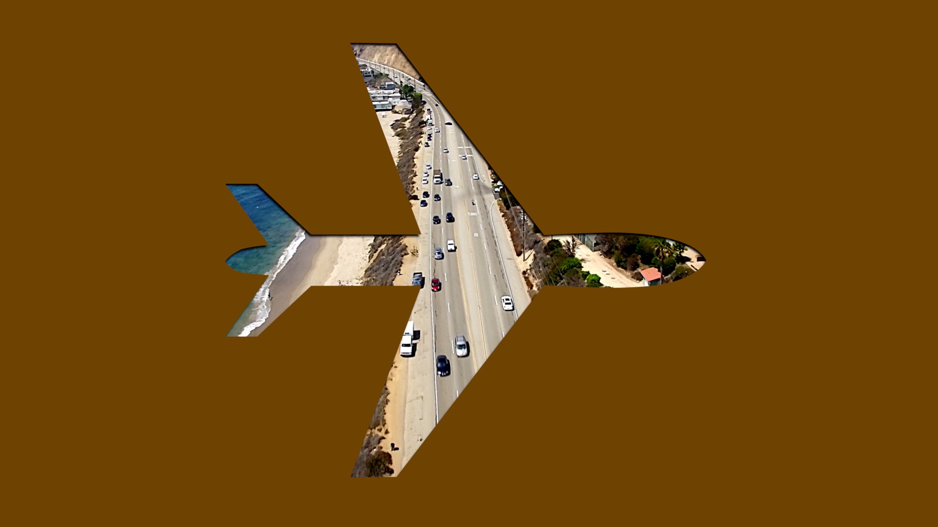
It is primarily set up for Icon text. There is a font that accompanies the Transition that needs to be installed. (ZZSCFlyShaReg.ttf which appears in Font Menus as ZZSC Flythrough Shapes – Regular).
Using icons is not necessary. You can bypass the icons and use any text and font you want.
Animation is automatic. No keyframing.
There are controls to help line up the fly-through spaces to make the effect optically pleasing. See my tutorial on the Fly-through text effect for more information about that.
Parameters
Character Selection (checkbox). Activating this option will display the available icons in the transition. Select the icon you wish to use by clicking slightly to the right of center and dragging the mouse either left toward the center or slightly downward and to the right. Icons at the right edge may require a slightly extra effort to select. You will see the selection on the screen when it occurs. Simply Copy/Paste the character into the Text box immediately under this option.
Text: where you enter whatever you will used on the screen, either icon of typed out text.
Collection: If you organize your fonts in Font Book, this is a shortcut to the category of font you will find your font choice in.
Font: All of your fonts are available. Note that you cannot edit font options with a Text Inspector. The only options you have are published within this Transition.
Tracking: adds (or subtracts) spacing between all the characters in your text. If using a single icon, this parameter is useless.
Baseline: Used to align the vertical center of text to the line that characters were normally rest on. In 3D Z-space animation, this helps minimize a parallax that may not work well.
All Caps: this “effect” doesn’t work as well with lowercase characters… all the time. (It can be done!)
Z Depth Offset can be used to send the starting position of the text/icon much further back. Will make the animation appear to accelerate more as well as make the text smaller to begin with.
Size Offset can be used to scale the text further (on top of the Z Depth position).
Ease Fly-through: adds ease out/ease in on the start and end of the animation.
Horizontal Offset/Vertical Offset: these parameters are specifically for the *end* of animation to align the on-screen stenciled text to a center of your choice.
Rotation: Yes! You can rotate the text (and icons) you use (very useful for the arrows!)
Drop Shadow: (Optional). Typical controls — enhances the appearance of the fly-through visual effect.
Solid Color Overlay: three options: None (obvious). Replace (complete overwrites the incoming clip from the start of the transition. Fade-In is basically a replace with a ramp in opacity from the incoming clip to the solid color. Depending on the time set up for the transition, this is *very short*! (Looks good though.)
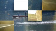
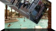
Demo:
Keep up to date with Sight-Creations on Twitter.
A good place to see all of my effects as well as several tutorials and other demonstrations in use is on my YouTube channel.