Tag: final cut pro x

Strange Attractor User Guide

Strange Attractor User Guide

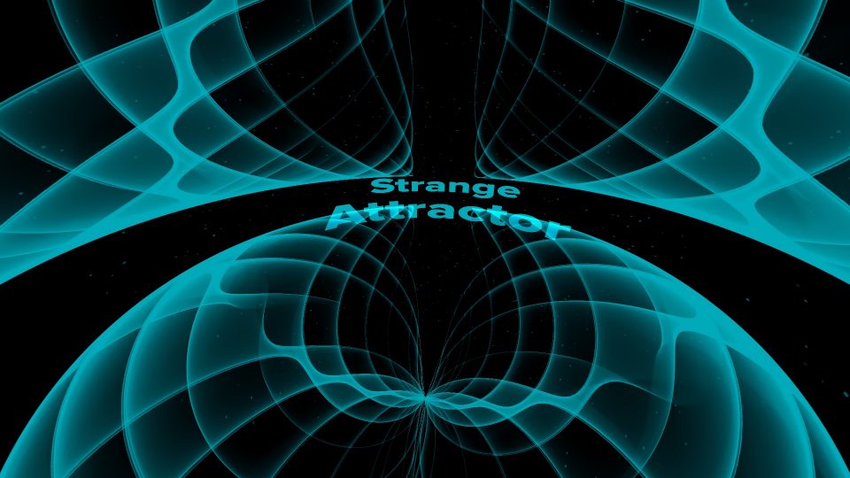
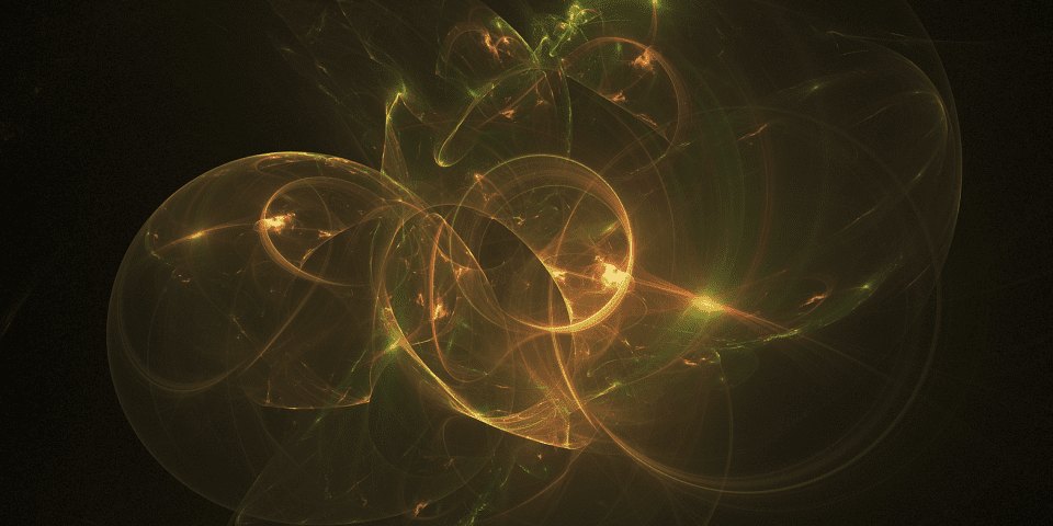
Strange Attractor User Guide

Build your own Strange Attractor Title Card/Background

There is quite a lot going on with this tool, so let’s dig in.

There are three sections of parameters: Wave Design, Particles and Text. The first thing to do is look at the individual Wave settings. There is a Default and 23 variations. You will use one of these as the “core” of your attractor design. By default, only one instance of the “wave” is shown and it can be worked with just as it is. The single instance wave will render the fastest, play without rendering the best (although it is recommended to set playback to Better Performance.) Most of the “Arrangements” will perform quite well, but the more instances of the original wave used, the more intensive rendering will be.

Note: this generator has no solid background. It is not meant to be placed over video, however, it is possible to place a Solid Color generator between Strange Attractor and video with the clip Opacity set just below 100%. This effect looks best with an all black background, however, as always, I leave those decisions to the end user.

There are 9 arrangements. After the singular, they are listed in the popup menu as two numbers separated by a dash. The first number is how many “arms” are used. The second number is how many instances are placed along that arm. There are up to three arms and up to 3 wave pattern instances for a total of 9 instances at once. There is no real predictable way to state how these will be displayed since they are all varying sizes and the distortion applied will change how they are applied in “space”… Already there is extreme variation of the variations. 24 Variations times 9 Arrangements already makes for 216 different attractor patterns, and that’s just “to start”.

The next parameter is where all the fun of finding your own treasure starts: Offsets. Displayed are X and Y, but if you dial down the disclosure triangle, you will also have Z. These values change the spatial displacement and orientation of the original wave form (default or variation choice) in what is essentially the “bulb” of space, warping and bending the waveforms into new patterns. Since this operation affects the original pattern only, any changes made affects all the other displayed patterns and the operation can get quite intensive making it difficult to change the values in the inspector using the sliders or even dragging on the numbers. It is recommended that you set the Arrangement to 1-1 (or 1-2) while making Offset changes to take the load of the processor somewhat.

Expanse changes the size of the area the wave patterns are spread across. Values can be from -100% to 100%. The actual distance is more or less meaningless, but it’s large. The minimum distance is 100 pixels. The default is 50% or halfway between minimum and maximum and serves as a “best choice” starting point.

Orient Scene allows you to turn the entire “scene” to assist in placing the Animated Text (which is going to be challenging to manage because of the “black holes” and/or crazy edit points [where “things” appear to emerge and is not always the same location!! — Almost everybody is familiar with the concept of a wormhole — well — this plugin has it!]

The Wave Fill Fade is a reverse Opacity control. As you move the slider to the right, more of the “thin” portions of the waveforms become transparent leaving a much harder edged line. Moving the slider to the left will show more of the thinner gradient and will begin to boost the Dark Color (if there is one). In this plugin, Black tends to be transparent. Darker shades (of “Dark Color”) will be more transparent than lighter shades.

Attractor Speed. By default, the attractor doesn’t move and there is no “on-drop” animation applied. This is your choice! Apply any amount (even very small amounts) of Animator Speed to start the attractor wave moving. Positive and Negative directional values are available, so experiment!

Dark Color can be used to “fill” the waveform pattern with a secondary color (or even be used as a dominant color using the Light Color option as a dark contrast – it’s a very interesting variation!). As mentioned, Black (rgb: 0,0,0) tends to be transparent).

Light Color defaults to a medium cyan. It just looks… celestial. For either Dark Color or Light Color, very bright or very light shades do not usually look all that great. It is recommended that the intensity of color be maintained within 50 to 75%. This is another “season to taste” situation and not all hues have the same apparent brightness at consistent settings.

The Angle/POV Change parameters allow you to set the initial orientation of the attractor and it’s automated animation. They are grouped according to X, Y, and Z. You do not need the POV Change parameters if you intend to perform specific keyframed animations. The POV Change parameters will automatically animate the corresponding angle according to the (start) Angle and apply an automatic change of the total number of degrees indicated over the life of the generator in the storyline. There are no timing markers used. The default length of the generator is 10 seconds. If you set a POV Change to 360º, then the attractor will animate 360º in the 10 second life of the generator or 36º per second. Very fast animations are not that attractive with this effect, but I’ll leave that for your experimentation.

Init. Wave Angle is short for the “initial waveform angle” for the “first” instance of the original waveform pattern. All of the waveforms are related to each other in their “connection” in the scene. If you use this parameter by itself, leaving it’s sister parameter: Waves End Angle at 0, then all of the instances in your arrangement will maintain the same angle turn provided by this parameter — at least in theory. In actuality, the operation changes the “fit” of the waveform shape in space and therefore alters the distortion acted upon the shape. There is no predictable result that can be described. Unlike Orient Scene, these two parameters only affect the waveform instances an nothing else in the scene.

Waves End Angle is similar to Init. Wave Angle in that if you leave Init. Wave Angle at 0º, this parameter will rotate all the instances to the same degree offset. When used with Init. Wave Angle, then all the instances will “fan out” evenly between the two degree settings.

Camera Zoom. This parameter is usually best left at its default setting. It can be used in modest measure to change the apparent size of the scene. Be careful with this because it will have side effects with the particles used. If the particle size gets too large, you can turn them off, but that in turn will introduce other side effects (explained below).

Show Particles. By default, this effect has a lot of particles flying around in the scene. It’s not just because it looks cool or nice, but they function to cover up a side effect. There is a seam that appears when the particles aren’t filling up the “distortion” space. Having them filling up the background keeps that seam from becoming too obvious. If you look closely at their animation, you can see a line in the scene where the particles come together and disappear. It’s actually a cool effect and works nicely, but they can be turned off if you don’t mind the seam. You can use Orient Scene to set the seam at any angle that works for you and you can change up the presentation of the attractor to also “cover” or disguise the seam. You attractor can be made to look quite natural, particularly using a 1-3 or 3-1 (or more arrangement).

Particle Color is a gradient used to define the look of the particles over their life. There is a fair amount of transparency so that they never get too bright and overtake the scene. Use this parameter to colorize your particles. Each particle “lives” for one half the length of the generator (or 5 seconds). They were built to exist in the entire space from the very beginning of this effect so that the apparent seam would not appear, then animate closed as they filled the space. On the other hand, depending on the attractor’s space, sometimes a wedge shaped gap will appear in the background and particles will only appear in a smaller portion of the “great circle”. Particles will not necessarily always fill all the background of this effect. (There is no other way to explain it.)

Speed (Particles) and Speed Rnd (Part.) are comfortably at their default. Season to taste. The Speed Rnd (Part.) is a random change from the Speed setting, meaning that on rare occasions, some particles will be generated with no speed — they will be stationary! If you reduce the Speed setting, then some particles may actually go backwards from their emitted direction.

Particle Max Size is set to a very small number making them look as much like “debris” as possible. If you increase their speed or their size, you will see much larger circles moving in the scene.

Emission controls (pun intended). Use these to set the particles speeding off in different directions. The Range variant spreads out the emission over a randomly conical angle. When Range is 0, particles are emitted in a straight line in the direction based on Longitude and Angle. Angle is the counter-clockwise angle around the vertical axis and Longitude is the angle from straight at you, then over the top and around the back as it rotates around the horizontal axis.

Radius is how “tightly” grouped the starting points of the particles are. The default of 100 is a percentage of a very large span. The minimum value of this parameter is not a point, but a small circle just large enough to not introduce more distortion problems into the scene.

Text

Edit Title is off by default. This is a checkbox which will allow you to turn on the editable text for viewing and editing in the Viewer directly. You can also simply turn on the Edit Title text to use as a flat text overlay on the scene if you prefer not to use the Animated Text. When editing the actual text, use the Text Inspector (it should automatically be switched to as soon as you click on the text in the viewer.)

Animated Text is a copy of the actual Edit Title text that is placed in the distortion space scene of the attractors. Animated Text can also actually interact with the attractors in some circumstances. As described before, the space distortion in this effect creates a seam that actually changes with the “size” occupied by all the elements in the scene, which includes the animated text. When the text is keyframed to “push” beyond the bounds of the scene, it can actually “open” a gap at the seam… Use the parameters below to accomplish this effect.

Anim. Text Scale can be used to resize the animated text. The size of the text is also determined by the Edit Title text, so the two can be used in combination if desired.

Position is an X,Y, Z control for the location of the text within the scene. However, since the space is distorted, there is no real way to determine if these parameters are going to behave “as expected”. It will depend on if the text is in front of the center of the universe, or behind it, as well as other things like the Orient Space option, etc. This is definitely a “relative” positioning parameter.

Rotation is an X,Y, Z control that is also mostly a relative positioning parameter. Dealing with rotations in an already distorted space will just have to be something you watch on the screen, and play with the parameters. Sometimes these will behave exactly as expected and other times… expect to scratch your head.

Anchor Point offsets a point from the Animated Text (which will depend on Left, Center, Right justification) by the distances provided. When using Position or Rotation, the offsets will be referenced from this point. It is particularly useful with Rotation if you want the text to rotate around an offset point an not its “center point”. However, and again, the space is already distorted so the expected result may not even be close to what you get.

Color will colorize the Animated Text. It has nothing to do with the Edit Title text color.

Blend Mode is set to Add by default to make the text look as if it is “intertwined” with the Attractor. Other modes provided are Normal (opaque and always “over” the attractor), Color Dodge and Linear Dodge give a nice “reflective light glow” look of the attractor on the text; Subtract and Vivid Light give a nice cast shadow look on the text from the attractor.

The last parameters allow you to create a fade in/out for the text. Time is in frames. Offset is in Frames. It’s best to set the Offsets by positioning the playhead where you want the text to appear and fade out and drag the individual Offset parameter until the text appears or fades where wanted. From a clip in the timeline at any time other that the first frame, it’s very difficult to calculate the frame offsets in your head!

The Tower Rise animation option

The Tower User Guide

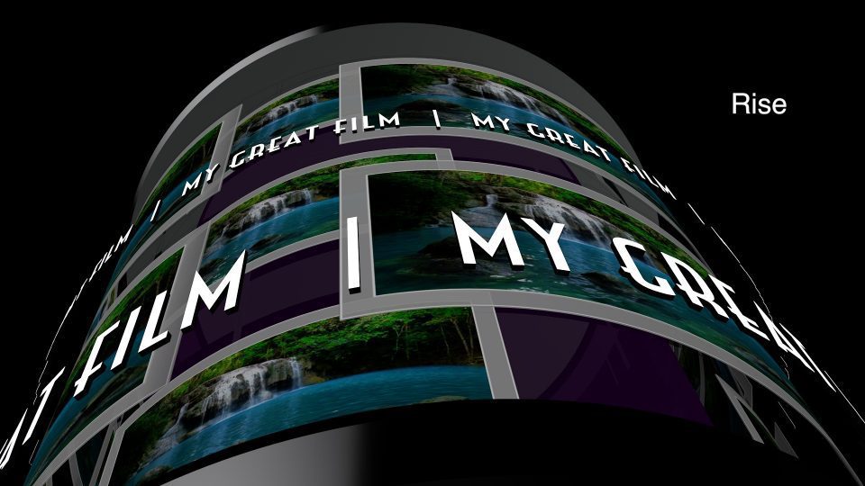
The Tower User Guide

The Tower started out as an emulation of the iDVD Revolution theme and originally called Revolution. The project was begun over 3 1/2 years ago — one of the first models attempted when 3D Text became available in Final Cut Pro X. It was plagued with problems. The 3D aspects of the model could be handled easily enough but the “textures” (drop zones and other artwork) suffered. There are technical issues that had to be learned and since there is no documentation, these had to be learned by experimentation. This involved technical experimentation with the very text design used to construct the model, the reason you must install a specific font and all of this took, literally, years. The effort was not a constant involvement with this particular project and it has been alternately abandoned and taken up again about seven times since its inception. A recent, accidental discovery has allowed me to finally put all the pieces together.

There are three preset animations and a “null” to turn the others off: iDVD Revolution (on which this effect was originally based), Rise and Wipe. These preset animations are demonstrated in the video below (I expect less Motion noise from 60fps projects, or try using our SC Motion Blurs effects).

There is a Text Field in the upper right corner (by default) referred to as a “Static Title” which provides the text used in all parts of this effect. Whatever you type there will be copied and repeated in the cylinder effect. This can only be a single line of text. If you need more, use a Basic Title to add additional information.

The position or rotation of the Static Title cannot be animated by keyframing. You can click and drag the title anywhere you need it. Use the Static Title Opacity to fade it in and out of the way when necessary.

[Parameters listed below denoted by ♦ can be keyframed; all others cannot.]

♦ Static Title Opacity — use this parameter to fade the “main title” text or take it out of the scene entirely. Fading the Static Title text has no effect on the text on the circle paths.

♦ Effect Transparency will allow you to fade in/out the cylinder/tower graphics.  The iDVD Revolution preset animation uses a Camera Fade and so produces an entirely different effect for transparency than this control’s opacity will.

Drop Zone — this is ubiquitous across all of FCPX. In order to load video into this, you must select the “source well” then go to the Event Browser or the timeline and mouse over a clip. Find the starting frame (the cursor will skim the clip) you want the effect to display and click on it to load the clip. Select the Apply button under the Viewer. You may repeat this process as many times as you like to fit the precise video display you need.  If you select a starting point that does not allow the full time of the remaining clip to “fit” into the length of this generator, you will need to shorten the time of the generator or find a longer clip. You can make longer clips by fashioning multiple shorter clips into a compound clip and use the compound clip as if it were a regular clip. [Note: using a timeline video clip does not always result in video that “plays”, but displays as a still frame. If this is the case, use the Event Browser version, or if other Effects are required, create a compound clip to add to the source well.]

(Drop Zone) Pan and Scale — these parameters can be used to resize the video/image used in the drop zone and reposition it horizontally and/or vertically. This can be handy if you want to zoom into a portion of the image and change its orientation (e.g., centering.) Scaling smaller than the “view port” will reveal a black background which can also be used for an interesting effect or view of the subject. Pan and Scale for drop zones cannot be keyframed.

Main 3D Params

♦ Position — use these parameters to position The Tower graphics in the Viewer in “3D space”. Dial down the disclosure triangle to reveal the Z position parameter. Manipulating the Z parameter can be used to “scale” The Tower larger or smaller, but it is far more efficient to use Scaling (below).
♦ Rotation — use these parameters to change the orientation of The Tower in 3D space. FCPX only shows the Z rotation (“spin”) by default. Dial down the disclosure triangle to reveal the X and Y rotations. The X rotation parameter will “lean” The Tower forwards (positive) or backwards (negative). A tumbling animation can be built with this parameter. The Y rotation parameter will “turn” The Tower so that it faces offset directions.  The Y rotation can be used to set a starting orientation to be used with Cylinder Spin (below).
♦ Scale offset — This value is restricted at a minimum. If you need to scale The Tower model smaller, then use the Z position parameter listed above.  The default view of The Tower is to fill the screen top to bottom (with slight overhang at the caps). Scale offset can be used to quickly focus in on a smaller region of the cylinder model.

Cylinder (parameters)

Cylinder Turn — this is the amount of rotation that the cylinder (not including the wrapping text) will rotate over the life of the generator.  It is set by default to 45º which is a nice rate of rotation in the “left to right” direction (contra the text motion). Automated motion can be halted by setting this value to 0º and it can be set to negative values (“right to left” motion) by clicking directly on the numerical value and dragging the mouse downward into negative territory. This parameter cannot be keyframed. If you need to animate the rate of turn, set this value to 0 and keyframe the Rotation Y parameter above.
♦ Color — (cylinder core color) set by default to a dark magenta. This can be any color you want: right click on the color swatch and pick one from the picker. This value can also be keyframed to animate from one color to another (a feature exceptionally overlooked in FCPX!)
♦ Brightness — this parameter is not usually found with Color options but is a feature of 3D Text in FCPX. It is keyframable and included for effect with this template.
♦ Shininess — another 3D Text specific parameter that will allow you to alter the light reflective properties of the cylinder “core”. It gives the effect of altering the “texture” of the core surface, more reflective is more glassy, less is more like “plastic”.
♦ Opacity — setting this parameter value to 0% will eliminate the cylinder core from view leaving only the “floating” curved drop zones. It is an interesting effect. Setting this parameter value to 100% will make the core a “solid” (from “glassy” to “metallic”).

♦ Camera Perspective — this parameter was a late addition and it didn’t really have anywhere else to go, so I stuck it in the Cylinder Core section. The default value is 45º which is roughly equivalent to a 50mm (“normal”) lens on a modern DSLR camera. Setting this value to 0º will distort The Tower model, making it look… flatter and somewhat “bent” (you have to see it…). At 15º, the image will look slightly smaller than normal but less flat. At 137º (default orientation of The Tower) the small text ring at the middle will almost completely fill the screen, and going above 140º will start taking you into the inner core of the effect — looking from the inside out! [Reminder: keyframable!!]

The next two sections concern the rotating text sections starting with the larger, Lower Text Ring section then followed by the Upper Text Ring section. Since both sections contain the same parameters in the same order, I will simply put them together as one.

♦ Repeats — how many times text is repeated along the circle path. The defaults are 4 lower/9 upper for the default text of “My Great Film” provided as a “holder”.  The minimum repeats for Lower Text is 1 simply because the text is large enough to completely wrap the cylinder if the text is long enough.  The minimum repeats for Upper Text is two.  The maximum repeats for Lower Text is 12 and for Upper Text is 20.

♦ Spin — This is the auto animation rate of spin of the corresponding circle of text. The amount of spin is in “degrees per second” (roughly). The range of spin goes from -90º to +90º (which are very fast and not recommended). The default values are within the recommended range for use, however, depending on whether you keyframe the Y rotation, you may need higher rates of spin to make the offset to the cylinder obvious. By default, the Lower Text spin rate is 1/2 the Upper Text spin rate. This gives the viewer a chance to read the larger text as it moves which the faster speed for the smaller text makes the repetitions more obvious.

♦ Tracking — distance between characters. Use this parameter to even out any large gaps in the text and use this to help even out the gaps between the vertical bars within the texts. Vertical bars are separate from the actual text and even though their Repeats are automatically duplicated from the text repeats, their relationship to the text on the circle, by default, aligns to the same degree points along the circle (see V.Bar Offset).
♦ V.Bar Offset — allows reposition of vertical bar separators w/r/t text. Usually you will want to reset the degree offset from the text starts to place them in the exact middle of the text repeat gaps. These values are simply offsets and do not affect their synchronized spin with the texts. That said, this value can be keyframed to behave in any manner you prefer (or in conjunction with Path Radius).
♦ Path Radius — This is a “rigged” fixed positive range from 0 to 100%. At 0%, the text’s circle path is as “tight” as it gets around the cylinder. At 100%, it is as far as it gets. This value is quite wide, but not unlimited (and the max value will not be revealed as it really makes little difference.) This parameter may be keyframed to effect. However, if expanding the radius or collapsing it in an animation, you will also want to animate the Tracking values and the V.Bar Offset to maintain the relationships of space and v.bar position during the animation. It is *not* recommended to animate the Repeats parameter to fill gaps in expanded path radii.
♦ Offset Angle —set starting angle or keyframe spin animation. The V.Bar and Text are connected in any animated rotation (the V.Bar Offset is “additive” to this animation) and this parameter can be used to offset the starting angle (or keyframe additional animation apart from the Spin parameter).
♦ V. Offset — this sets the vertical location w/r/t its original location upon the column. If you need the circle texts to disappear, this is the only way to accomplish it — by dragging this value so that the text goes off-screen. There is no option for opacity in these circle texts.

Background parameters

There is a solid color background to this generator.

♦ BG Color — Sets the color of the background.

♦BG Opacity — Sets the opacity of the background. Overlaying this effect upon the storyline allows for a fade through the color.

Demo:

Keep up to date with Sight-Creations on Twitter and Facebook.

A good place to see all of my effects as well as several tutorials and other demonstrations in use is on my YouTube channel.

Keying "inside and outside" on the same footage

Keying Inside and Outside

You do not need a Motion Template for this effect!

Scene: You have a green screen clip and you want to replace not only the green screen but also the subject with replacement media.

I came across this problem on Apple’s discussion board (FCPX forum) and thought it was an interesting problem. It’s actually quite simple, but there is a catch if you don’t know what to look for.

For this demonstration, I will be using a free sample (practice) green screen clip available from hollywoodcamerawork.com. The download is in the Godiva Medium section about halfway down the page. Here’s a frame:

HCW GodivaMedium

This is a relatively awful green screen. The green isn’t “even”. It is very difficult to pull a decent key especially in the area of the sheer fabric. It is, however, a very good clip to learn how to key and if you successfully pull a good key, then you will have learned something useful!

The effect I want is to have our model replaced with fireworks as a silhouette effect and the green background replaced with an icy waterfall (fire and ice 😉 ). Two mattes from one clip.

keynoteTrace

If this question hadn’t been asked, this is not something I would have thought of by myself… It’s actually rather cool!

How this is accomplished is rather simple:

1) apply they keyer to the green screen footage — invert it! — and overlay it over the fireworks clip.

(When you invert a keyed green screen, you get the original green screen back as everything that is not green is masked!)

2) select the green screen clip and fireworks clip and make a compound clip.

3) apply the Keyer to the compound clip and overlay it over the icy waterfall clip.

Pretty simple provided 1) you get a good key and 2) you know how to get around the non-transparent “white out” where the green screen used to be. This is what it looks like:

whiteoutKey

This is a WTF moment. It’s supposed to be transparent. So what happened?

It turns out that the provided Keyer effect in Final Cut Pro automatically sets a 46% Spill Level (I don’t even know what this is because it is separate from the Spill Suppression — it seems to be the “primary” spill removal tool; it’s documented that it will fill the green with a light gray color instead of transparency.) The solution at this stage is to simply set the Spill Level parameter to 0% and that will clear out the white-out to transparency again.

When completed, you will end up with a compound clip containing your green screen footage (with inverted key) over the media used to fill your subject, and placed over another clip used to contain the media used to replace the green screen. It will look great! And, you didn’t need to use a special Motion template to accomplish it.


That said 😉 —

If you use SC KeyFX scKey Replace, you only need one clip. “scKey Replace” allows you to select any color (use shift-click and/or drag to include more) very much as you would in a “paint” application like Photoshop. You can stack the effects on a single clip and use the drop zones to fill the parts. There is a feature that will allow you to blend the replacement media with the original media using Blend Modes if you wish. With it, you can pull off an even more interesting effect of lighting up your subject with the filling media.

In the first frame: throughout most of the play through, the subject model is silhouetted. However, when the “flash” is close to her face, you can see the fireworks “light up” her face briefly. It’s really impressive to see!

screplace1Model’s face is silhouetted

screplace2Model’s face shows some color detail. (It is more obvious in playback.)

You cannot get this kind of effect from the basic Keyer effect since the blend modes provided by scKey Replace are not available in Keyer.


See SC KeyFX Tips for more information.

Sliding Thirds - fully Loaded

Sliding Thirds User Guide

Sliding Thirds User Guide

A title effect for FCPX

Description

This effect is for 16:9 media. You can use it for other aspect ratios, it simply will not look as good.

Sliding Thirds title is a simple yet powerful effect. Even though it is being referred to as an “effect”, it is actually a Title plugin for FCPX. And even though it is a “title”, no text has been provided for use. Sliding Thirds is very much like an adjustment layer you can apply to your storyline to provide animation support for any other kind of title you would like to apply. Its effect can be extended greatly by “stacking” instances of the Sliding Thirds title in your storyline. (Examples below demonstrate a “pyramid” stack, an “offset” stack, and “straight” stacks.) Directly stacking one upon another will double its effect.

The default setting is to have the left side panel animate into view for a little over 1 second (including the offsetting of the “canvas” if set). At the end of the title (about the last 1 second) the panel slides back off and any offset of the canvas is restored to its original position. The title can be as short as 2 seconds and 10 frames long or as long as your entire project. Panels are activated by checkbox option. It is allowed to not use any panels and only use the Horizontal and/or Vertical Slide to move what is on the canvas. Sliding Thirds can be used simply to “push” anything on the screen by up to one third of its dimension. Stack another Sliding Thirds on top and move everything another third, including whatever you add to the Sliding Thirds title underneath. Stack as many as you like to keep moving panels across the screen.

See the demo video (below) for a variety of effects than can be accomplished with this single simple title.

Horizontal/Vertical Slide: Values default to 0. Sliding left moves the screen (storyline) media to the left. Sliding right moves the screen media to the right. Values go to 100% with minus or positive indicating direction of movement (negative vertical is downward). A 100% offset will move the screen media just far enough so that the edge of the media will match the opposite edge of its corresponding panel (if used). Offset values of 0 will not move the screen/storyline media. The usual value of 50% will move the storyline media just far enough to maintain its center to the center of its new visual space between its panel and the outer edge of the video. This value may be keyframed to customize its appearance as well as to make adjustments when stacking Sliding Thirds. Keyframing can be used to override the built in animation timing. An example of this is demonstrated in the Demo video below.

Fill Color: The color used for all panels. There is no mix and matching colors for panels, they are all the same for one instance of Sliding Thirds.

Fill Opacity: Sets the transparency for all panels.

Use Left/Right/Top/Bottom Panel: Checkboxes allowing selection of which panel appears. They can all be used or none of them can be used. If you would like to build a “reveal” effect using only Horizontal/Vertical Slides, you must combine the Sliding Thirds title with a clip in a compound clip and place the media to be revealed below the compound clip in the storyline. Without using a compound clip, Sliding Thirds will move *everything* beneath it including clips beneath the storyline (but not audio!)

Drop Shadow: Typical drop shadow controls; should not need explanation.

Drop Zones: There is a drop zone for each panel. The drop zone is sized to exactly fit the panel it belongs to which will make media placement convenient: the center of the dropped media will always align with the center of the panel. Included with each drop zone is a Pan parameter which allows adjusting the positioning of the media within the panel; and a Scale parameter which normally will be used to “shrink” one of the dimensions to fit more of the view into the panel, e.g., scaling the X dimension to less than 100% to squeeze the media horizontally for Left/Right panels, or for shrinking the Y dimension to fit vertically into Top/Bottom panels.

Added recently:
Animate Intro/Outro: The animation only determines the appearance of the panels. Turned on, the panels will slide in. Otherwise they will instantly and continuously be “on” for the duration of the Sliding Thirds title in the storyline. Sometimes it might be useful to have the Outro turned off if you simply want to move a clip in one direction and not have it be returned to its original position (usually when stacking multiple Sliding Thirds…) It’s at the bottom of the parameter list to mostly be “out of the way” and there if you need it.

Parameters:

Sliding Thirds parameterList

Basics

Sliding Thirds consists of two parts: The sliding background panel and the storyline content. Storyline content means everything (media, generators, titles, or anything else you can add to your project) underneath the Sliding Thirds title instance. A Panel is a complex background widget consisting of a solid color and/or drop zone content.

Panels are designed basically as a solid color background for any other type of content you wish to add above the Sliding Thirds title. Panels may be any color. Panels may have any level of opacity, they can even be made invisible.

Drop Zones can contain anything. Media, other titles, other generators, and compound clips of any other combination of media, generators, titles, etc. Using Drop Zones that are filled with titles or other transparent background media still display the background color solid panel depending on your settings.  When using another title for any of the four drop zones available, you may create a title in your project anywhere in your project, then select the drop zone source well in Sliding Thirds and select your (temporary) title and Apply. Once the content is added to the drop zone you may delete it from the storyline or change your title to be reused in another drop zone. When you’re done with adding drop zone content, you may delete any item from the storyline that you created to place in the drop zone.

Drop Zones in Sliding Thirds are designed to have the aspect ratio of the panels on which they are applied. When designing titles or generators for adding to a drop zone, design for the center of the screen. The center relationship is maintained within the custom drop zones. You can offset and/or scale the drop zone media with the supplied parameters for each.

Use as a Reveal effect

Panels are optional. The left panel is on by default but may be turned off. The storyline media may be animated (up to 1/3 the screen in either direction per instance of Sliding Thirds [if stacking is used]). If all the Sliding Thirds titles are combined with media immediately below their instances into a compound clip, then any other media below the compound clip will remain stationary. Combining the animated compound with stationary media will create a reveal effect. This may also be used for basically any kind of media: to reveal a title or reveal another clip. Turning off the Animate Outro option with three stacked Sliding Thirds instances can be used as a slide transition.

“Fully Loaded”

One Slider Thirds title. The ice cream sundae clip is in the viewer and all four panels have their drop zones loaded. When the drop zones are empty only the panels are visible provided their opacity is enough to make them seen.

Upper and Lower Thirds are always dominant. When using color panels without drop shadows, it is possible to make L-shaped fill regions. When using Stacking (see below), for example for a 2/3 slide, Drop Shadow seams can be eliminated by applying a drop shadow only to the lowest instance.

Stacking

As stated, Sliding Thirds will move everything underneath its duration. You can add basic titles (or any other type of media) over the storyline and Sliding Thirds will gather it all up and slide it (by the Horizontal/Vertical Slide amount). In the example below, there is a Basic Title over the storyline video. About 1 second after its appearance, a Sliding Thirds “instance” is placed. The Basic Title text will slide with the storyline media as if it were part of the scene. If the Sliding Third has video in its drop zone, then that video will slide into view to “fill the gap”. When the Sliding Thirds instance ends, the media will slide back to its original position.

Stacking more than one Sliding Thirds will continue to slide media — including a Sliding thirds panel or drop zone that is underneath it. The maximum slide for each instance is 1/3 the screen. Two instances will slide 2/3s of the screen and so on. More than three instances will begin to slide panels off the screen at the other end — but they will slide back on when Sliding Thirds title ends over the instances below it. In the case of “Offset Stacking” as shown below, the returning media will “collapse” behind the last (topmost) instance until finished.

Sliding Thirds Offset Stacking

The above image shows the storyline section for the Demo: Offset Stacking section of the demo video.

Pyramid Stacking

In the example below, there is a Basic Title (“Demo Pyramid Stacking” from the Demo video) on top of the storyline. Four Sliding Thirds titles have been stacked and retimed to form a pyramid shape, followed by another Basic title on top. The top Basic title remains stationary throughout the animations. The Demo Pyramid Stacking title text at the bottom of the stack is animated four times – once for each Sliding Thirds title added and resulting with the Demo … text moving off the right side of the screen upon the exectution of the fourth stacked Sliding Thirds. In this arrangement, when the topmost Sliding Thirds ends, the entire screen (accumulated titles below it and the storyline) will reset back the same displacement amount. When the third Sliding Thirds ends, the screen resets back another third distance, etc. until the storyline is restored to its normal appearance.

Sliding Thirds Pyramid Stacking

The example below demonstrates the use of interim text titles under the Sliding Thirds. The green arrows show the positions of Sliding Thirds titles and the yellow arrows highlight the positions of Basic Text Titles used to label the entire accumulated scene beneath each text entry. The yellow circles illustrate where titles were “bladed” and their content changes, so as the animation begins resetting to the normal storyline appearance, the titling has been changed to extend the messaging.

This example is taken from the section of the Demo video below beginning with the waterfall and sliding up six times.

Pyramid with text added

Straight Stack

Add a Sliding Thirds title to the storyline and set the Horizontal or Vertical (or both) offsets to ±100. Hold down the Option key and drag upward to create a duplicate of the Sliding Thirds title. With snapping on, align the two titles together. Animation will now cover a 2/3 distance across the screen. Repeating this action will cover the screen with either panels, drop zones (in 1/3 sections) or, by making a compound clip, a full screen “reveal” effect with any other additional media placed anywhere below the compound clip.

Creating a Paneled Split Screen

Apply a Sliding Thirds title. Pick which panel to use and adjust its color. Leave Horizontal/Vertical Slides at 0. Option drag a copy immediately above the first one (which also duplicates color and panel choice). For the instance on top, set the Horizontal or Vertical Slide to 50%.  To the instance on the bottom, adjust the drop shadow if used (Blur = 0 and Opacity =100% will create a solid line). Apply your titling or other media content to the solid color background portion of the screen:

Of course: you still have plenty of options for customization!


Sliding Thirds is an extremely useful, easy, and quick utility to perform perfectly executed animations by thirds — no keyframing required. If you work with television advertisement, this tool is a must have.

Demo:

Installation Instructions.

Keep up to date with Sight-Creations on Twitter and Facebook.

short circuit is a glitch title effect by sight-creations and Short Circuit User Guide

Short Circuit User Guide

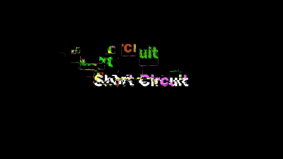
Short Circuit User Guide

by Sight-Creations

A Title for FCPX

There is an onscreen control (OSC) for convenient positioning on the screen. There is a Rotation parameter available just for fun.

Due to the way this effect was created, editing text on the screen is not allowed. You must change the text in the Text parameter in the Title inspector. All other controls for text (color, font, size, alignment, line spacing, tracking, etc) have been made available in the inspector for your convenience. The Collection parameter has been supplied so that if you use font collections in Font Book to organize your fonts, you can shorten the font list by selection your “favorite” collection first, then choose a font from that collection.

GLITCH PARAMETERS

Noise Smoothing
Noise has been added to this effect to create part of the texture. Noise Smoothing blurs (more like smears) the noise in a specific direction. The higher the amount, the smoother it will appear. Between 0 smoothing and about the default setting of 16, the smoothing will appear a little like a paint brush stroke. As the value is increased, the noise will be less apparent.

Noise Angle Mvmt
This parameter randomizes the direction of the “smearing”. At 0, the smearing is horizontal.

Glitch Coloring
This gradient can be customized to color the glitch effect. It uses luminance “mapping”. Darker shades of the Glitch pattern used will appear to be the color selected on the left side of the gradient. Lighter shades will map the right side of the gradient. You can use as many color tabs as you like. The colors of the gradient may also be animated. If you opt to animate color, make sure you have all the tabs of color you need for the entire animation. Adding tabs is easy: simply click the mouse in the “color bar” under the gradient bar and a new tab, containing the color clicked on will appear. (You can remove tabs by clicking and dragging them off the bar.) The gradient has a disclosure triangle to open it up for all of its available features. Since this is a luminance mapping, opacity tabs have no effect on the color used.

Glitch Color Over
On by default. Deselecting this option will have the actual text always “on top” of the effect. Its appearance will be affected by the Text color parameter. The glitch effect does not blend.

Horizontal Glitch Amount % / Vertical Glitch Amount %
These parameters determine how spread out the effect becomes. Near 0 will keep the glitches close to the text. The higher the percent, the more of the screen territory will become involved in the effect.

Short Circuit Title parameters

Glitch Amout % > Frequency
This parameter increases the amount of change in the glitching based on the direction percentage set.

Division Lengths
The glitching effect is “notched” in on/off states. The “notches” are generally different lengths of time (depending on the Random Seed parameter). Higher numbers for Division Lengths means that glitching will happen for longer periods of time (still very short — but relatively shorter or longer depending on this setting).

Frequency
This parameter will set, in general, how many glitches occur over the 10 second default length of this title. Setting or animating to 0 for this parameter *should* turn the glitching off. A setting of 1 will create a circumstance where the glitching is nearly constant. A setting of 2 will be approximately half and half, etc. A setting of 8 should provide 8 on/off cycles.

This title is designed to loop its animation. This method allows this title to keep the exact timing you achieve with your chosen effect no matter how long you make the title in the storyline.

All of this will depend on the setting of the Random Seed which changes everything. The timing of this effect is extremely flexible and its random mixing of time notches is part of its appeal making it seem more “natural”.

GLITCH SHAPING PARAMETERS

The glitch effect is determined by a pattern created in Motion and almost infinitely variable even though it is restricted so that will not become over-taxing to Final Cut’s rendering engine. The pattern is comprised of shapes that you can randomly size.

Pattern H Density / Pattern V Density
These parameters determine how many shapes are “crowded” in the horizontal and vertical space of the “texture”. (More below).

Scale X / Scale Y
Use these parameters to redefine the basic shape used in the texture.

Scale Rand.
This parameter will randomly change the redefined basic shape by the amount selected.

Randomize S… (Scaling)
This randomizing parameter will re-randomize the scaling of all the shapes in the pattern

Pattern Shuffle
This parameter will simply rearrange all the shapes within the pattern.

More on Glitch Shaping Parameters
It is possible to remove all shapes. At this point, the Glitching will simply be Noise (and the base text combined). By manipulating these parameters, you can design a multitude of different glitching effects (all in one title!)

TIP
When you find a pattern you really like, select the title in the storyline and save as a Compound Clip (set up an Event to collect saved favorite titles!)

Demo:

INSTALLATION
If you need help installing this title effect, please refer to this document:
https://fcpxtemplates.com/installing-plugins-for-fcpx (there are links to an outline and step-by-step video if you need to see the process.)

Keep up to date with Sight-Creations on Twitter and Facebook.

FCPX Motion Compatibility Guide

Motion Template Compatibility

FCPX/Motion Template Compatibility Guide

...and how to backdate a template to work in older versions


Whether you need to “backdate” a template to an older version of FCPX, or just curious to see if a template you’re trying to use is compatible with your version of FCPX, the Compatibility Chart below will help you.

People who design templates generally tend to use the latest version of Motion— we have to so we can keep up with all the “latest and greatest” features. What that generally means is that any new template created with the latest version of Motion will only work in the corresponding latest version of Final Cut Pro X.

Always having to use the latest version of Motion is not always convenient since there are plenty of Final Cut users still using older versions for whatever reason like hardware restrictions, project involvement, or even other less honest reasons — I don’t care. I’m not judging. When you’re stuck, you’re stuck and neither Motion nor FCPX has a method of being able to “backdate” templates, even if they are still compatible!

Below is a compatibility guide of all the versions of Final Cut from 10.0 to the current version with all the corresponding versions of Motion, plus some other data which will be covered shortly. You can also see their release dates, although some of the dates are only approximate for Motion as it was not always updated on the same days as FCPX in the past, or, so far.

You can also see there were several subsequent subversions released with no change of the other app, for example, FCPX went through versions 10.0.1, to 10.0.3 without a corresponding update in Motion.

Motion Template project files are just XML files which can be opened in any text editor like TextEdit. The first few lines are always exactly like this:

<?xml version="1.0" encoding="UTF-8"?>
<!DOCTYPE ozxmlscene>
<ozml version="5.5">

<displayversion>5.1</displayversion>

with the double space between the ozml and displayversion tags. Note that Motion 5.0 and 5.0.1 do NOT have a displayversion tag and the next tag in the file will start after the blank line following the ozml tag. This is as far into these files as you ever need to go.

The (simple?) Rules:

You cannot backdate a template that uses anything that wasn’t available in the target version of FCPX. For example, if your project uses shapes that use Size: Width and Height parameters, this must be converted to Control Points first if you need to backdate to FCPX before 10.2.0.

If you are using 3D Text, you cannot backdate before FCPX 10.2.0, it has no way of “knowing” what 3D Text is. etc.

And there are a lot of these little gotchas you need to be aware of if you’re going to successfully backdate a “modern” motion project for older versions of FCPX.

That said, the majority of “function” in Motion is the same as it was going all the way back to Motion 2.0 over ten years ago. Your chances of success are fairly good!

Instructions:

There are four types of Motion projects used by Final Cut: Effects, Generators, Titles and Transitions and they have the file extensions of: .moef, .motn, .moti and .motr respectively.

The Motion project files can be found inside the folder with the exact same name in the Motion Template’s folder (by class, then by category folder). You can right-click on the template project file and Open With… and choose Text Edit. Make sure TextEdit is in Text Only mode (rtf will mess things up!) It is highly recommended that you move a copy of the template to a safe location before making any edits to the file.

From the guide below, find your version of Final Cut (or your target version for backdating) and copy the OZML version to the ozml tag value (maintain the quotes!) then copy the DisplayVersion to the displayversion tag (notice the displayversion is exactly the same as the version number of Motion… so far).

You should not change anything else in the file, including the formatting of the XML unless you need to remove the displayversion tag to make Motion 5.0 compatible. Make sure the factory tag moves up to occupy the former displayversion position in the file (one empty line between the ozml tag and the first factory tag).

Save. You’re done. Go into Final Cut and see if it works. If you have a problem, you will probably just end up with a red icon with the Alert badge on it. If that’s the case, delete the template and replace it with your backup (or if you cannot use it, keep it moved out of the Motion Templates location until you upgrade to the current version of Final Cut.)

Apple’s release notes (most major additions will be listed here)

Motion Release Notes
Final Cut Pro X Release Notes

Release DateFCPXMotionOZML vers.Display vers.
06/21/201110.05.05.0no tag
09/09/201110.0.15.0.15.0no tag
11/16/201110.0.25.0.15.0no tag
01/31/201210.0.35.0.15.0no tag
02/24/201210.0.35.0.25.25.0.2
04/10/201210.0.45.0.35.25.0.3
06/11/201210.0.55.0.45.25.0.4
10/23/201210.0.65.0.55.55.0.5
12/06/201210.0.75.0.65.55.0.6
03/26/201310.0.85.0.75.55.0.7
12/19/201310.15.15.55.1
01/16/201410.1.15.15.55.1
06/27/201410.1.25.1.15.65.1.1
08/19/201410.1.35.1.25.65.1.2
11/25/201410.1.45.1.25.65.1.2
04/13/201510.25.25.75.2
05/14/201510.2.15.2.15.75.2.1
09/04/201510.2.25.2.15.75.2.1
09/10/201510.2.25.2.25.75.2.2
02/04/201610.2.35.2.35.75.2.3
10/27/201610.35.35.85.3
11/29/201610.3.15.35.85.3
01/20/201710.3.25.3.15.85.3.1
04/13/201710.3.35.3.25.85.3.2
05/26/201710.3.45.3.25.85.3.2
12/14/201710.45.45.95.4
04/09/201810.4.15.4.15.95.4.1
04/30/201810.4.25.4.15.95.4.1
06/21/201810.4.35.4.15.95.4.1
11/15/201810.4.45.4.25.105.4.2
01/17/201910.4.55.4.25.105.4.2
03/21/201910.4.65.4.35.105.4.3
10/07/201910.4.75.4.45.115.4.4
12/10/201910.4.85.4.55.115.4.5
08/25/202010.4.95.4.65.115.4.6
09/24/202010.4.105.4.75.115.4.7
11/12/202010.55.55.115.5
12/14/202010.5.15.55.115.5
03/04/202110.5.25.5.15.115.5.1
06/17/202110.5.35.5.25.115.5.2
07/08/202110.5.45.5.35.115.5.3
10/18/202110.65.65.135.6
11/15/202110.6.15.65.135.6
04/12/202210.6.25.6.15.135.6.1
05/19/202210.6.35.6.15.135.6.1
08/09/202210.6.45.6.25.135.6.2
10/24/202210.6.55.6.35.135.6.3

Use our automated backdating tool!

Motion Template Backdater can perform this task for you. Just upload the template, set the version of FCPX you are using and download the backdated version.

Templates uploaded exist only in your browser. They are not saved to the server. This tool is not used to copy uploaded templates.

chaotica 8

Change Project Frame Rates in FCPX the Easy Way?

Change Project Frame Rates in FCPX the Easy Way?

Change FCPX project frame rates:

Edit the XML file

I have changed the frame rate of an FCPX project using this method successfully. It started after I learned how to alter a Motion project file (also XML) to change the frame rates of projects. I wondered: if I could do it for Motion, if I could also do it with FCPX. Turns out… I could. All assets are automatically conformed to the new project rate.

This is not a supported method and should be considered experimental. If you attempt to do this – you will be doing so at your own risk. [I’m not going to take any responsibility for it. AFAIK, nobody else has attempted this.]

Follow these instructions exactly, and you should get a working project with the new frame rate. (I imagine you can change the size as well, but you can also do that from within FCPX which would be safer.) No knowledge of FCPXML necessary!

Create an “empty” project with the size and framerate you need. Use Custom Settings and set the specific frame rate you require.


File > Export XML.

Export XML on the project requiring the frame rate change.

Open the two XML files in TextEdit (Text Only – no rich text format! I recommend TextWrangler, but TextEdit wlll do… I think.)

Copy the top <format> tag from the “empty” project and replace the tag in your active project.

Save As a different name.

The format tag looks like this in context [it’s at the very top of the file]:

fcpx xml start
FCPX fcpxml opening lines

Just replace the line that starts with <format and ends with /> (exactly! same indent) with the copy from the empty project.

As a warning – make sure you *respect* the original line spacing and indentation in the file. Change only the contents of the <format> tag exactly where it is. Indents are tabs not spaces and indicates “levels”, etc. Changed formatting will invalidate the file. On the other side of this warning, all of the content of the original project seems to work perfectly (I’ve only done this a couple of times.)

File > Import > XML (to a different Event is recommended) the altered XML back into FCPX… You might be asked if you want to replace assets – I recommend you “Keep Both”. You should end up with two distinct projects, one with the old frame rate and one with the new.

That’s all there is to it. If you already have a project with the frame rate (and size) you want to copy over to the project to change, you can skip creating an empty project. Export XML(s). Copy and paste the contents of one line. Save As and import — you’re done.

Good luck.

— Fox

Hinged CRT - LiveType TV LiveFont Revisited

Hinged CRT User Guide

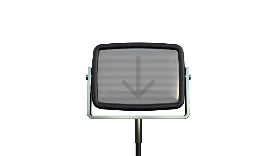
Hinged CRT Generator

User Guide

I want my LiveType® TV!

This is not a complicated effect. It’s basically a drop zone with window dressing. This effect requires the installation of a special font used to create the 3D text effect graphics (included with the plugin download).

This generator is auto animated via the optional Build In and Build Out parameters. The Build In animates the CRT up into view with a turn (just like the original). The Build Out turns the CRT and pulls it back out of the scene. There are other controls that can be keyframed to customize animations however you like and they can even be used to supplement the default animations.

There are sixteen default animations, eight standard and another eight with the turn direction reversed. CRT is animated from scene edges (top, bottom, right and left) and the Long descriptor means horizontal orientation of the CRT while Tall means vertical. The turn for all orientations is screen up to face front. The turn, if Change Direction is checked is screen down to face front.

Hinged CRT Modes
Build Animation Modes

First trick:
Set up the Hinged CRT generator as if it were a completely finished effect including all keyframed animations. Blade through the middle of the generator (all keyframes will remain intact) and change the Build Out animation to move in the opposite direction by selecting the Change Direction checkbox.

Parameters:

Hinged CRT FCPX Plugin Parameters

The Zoom slider will increase the size of the CRT to slightly larger than 1920 x 1080. For larger format media, use the Video Inspector Scale All parameter. It will still look great!

The Horizontal, Vertical and Rotation Offset parameters can be used to customize animations, even the Build In/Out animations already in progress! Rotation reorients the entire Hinged CRT model, not the CRT in the hinge mount.

The front screen “glass” effect looks a little lame… due to the nature of 3D surfaces in Final Cut, there’s not much that can be done. A Reflection Amount parameter has been added to help reduce the otherwise sharp edge effect in the glass. Another technique to disguise its appearance is to rotate the CRT about -7º to shift the shine slightly and smooth out the edges.

The next section of parameters deals with the Drop Zone. Select the Drop Zone source well and FCPX will present a “two-up” display in the Viewer. Select your source media from the Event browser. If your media is to be video, then as you mouse over the video in the Event Browser, the cursor will change to a pointing finger and you should see a skimmer bar. Keep an eye in the viewer and where you click on the Event thumbnail will select your first frame of video to be used. If choosing an image? It doesn’t really matter where you click.

The Drop Zone can also be filled with any kind of video you create in the storyline. You can combine video, photos, titles and generators just as you would for your normal video presentation. Bundle all the pieces to be used into a Compound clip and select the starting frame from your compound clip right in the storyline. Once you fill a Drop Zone with media in the storyline, you may simply delete that media from the storyline and the drop zone will retain what was placed in it. This is especially convenient if you need to simply place Title text in the CRT without having to make a compound clip. Once loaded, reuse the title for another instance of Hinged CRT or simply delete or “hide” the title (typing the V key on any kind of selection will toggle its “visibility” [or turn on/off audio as well.])

There are Pan and Scale controls to help align and/or fit video into the CRT screen. You may also changed the background color of the dropped material (e.g. text) with the BG Fill Color. The color selected will appear slightly different due to the design of the 3D model. Color “richness” can be compensated with the Contrast, Brightness and Gamma controls at the bottom of the parameter list.

Bad TV options are on be default but minimally used (scan lines). Unchecking Bad TV will present a “straight” media image with no “old TV” effects.

Waviness is a good way to provide “glitch”. Keyframe a jump into Waviness to last about a second and jump back out (reset to 0).

Roll is best used by setting from one extreme and keyframing to the other depending on the direction of the roll.  That action will give two “flips” through the image and looks convincing even when the Drop Zone media is scaled down (creating a rather large border between the two rolled images).

Static, like waviness, is best used in moderation, but the choice for all of these features is yours!

Reducing Color Sync will give the image color edges (faded red and cyan – probably looks somewhat “cool” with red-cyan 3D glasses :D).

Old TVs were very “flexible” in their display of onscreen images — the Saturation control can help with that little bit of realism as well.

The next three parameters deal with scan lines. You really have to play with them in conjunction with each other. The number of effects achieved cannot be enumerated here.

And last, the previously mentioned Contrast, Brightness and Gamma Controls. These can be used to adjust the actual dropped image in the Drop Zone.


Have fun!

[LiveType® is a registered trademark of Apple, Inc.]


Demo video:

Keep up to date with Sight-Creations on Twitter and Facebook.

Vegas Baby demo

Vegas Baby Title

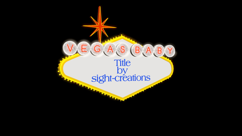
Vegas Baby User Guide

A Title for FCPX

The iconic Las Vegas Welcome sign was designed in 1959 by Betty Willis. It is in the style of “Googie Architecture” (FYI). She gave the design as a gift to the City of Las Vegas without copyright. It is in the public domain.

Vegas Baby is a 3D Text title for Final Cut Pro. It requires FCPX 10.3.4 or better, a video card with a minimum of 1GB of vRAM, and the installation of a specialized font (ZZSCVegasBaby-Regular.ttf) responsible for the “neon” letters and the sign shapes (it will be necessary to restart FCPX after installation of the font).

Vegas Baby is a complex effect with flashing lights and special textures (coin faces) and animations on two separate sides. Expect long render times. When dealing with the title in the FCPX storyline, it is best to set the View > Quality to Better Performance. Since Vegas Baby performs “reasonably well” using Better Performance, it was deemed eligible to be released. Please be patient with it!

Vegas Baby features an easily customizable “banner” (circled letters) and drop zone panels on the front and back sides. Separate titling for the front and back panels. Titling and drop zones can be combined. Complex text formatting will need to be handled via imported image/video or by creating compound clips in the storyline. An example would be any text message with more than one font used.

A 3D OSC (on-screen control) has been applied to this effect. For this reason, none of the text in the title is editable in the viewer but text boxes have been added to the Inspector to make text changes. To use the OSC simply single-click on the Vegas Baby panel and wait about 1 second. A Rectangular outline will appear and a 3D directional control will appear near the center of the rectangle region. It’s a hack… but it works. You can use the 3D control to keyframe rotation, but positioning via keyframe will have to be manually done with the parameter values in the Inspector. [Note: the OSC is a text character itself which is editable in FCPX – ignore anything you see in the Text Inspector as it pertains to this character used for the 3D onscreen control. If you accidentally change the character, its default is the character zero (‘0’) and its size is 856.0 if you find you need to manually reset these values.]

The Coin Features (Banner) Section

The neon letters in the circle shapes at the top of the panel are considered the banner. As with the real sign, the front surface of the circular regions have the pattern of a 1922 “Peace” silver dollar. The “coins” are not “regular” and each surface of the original WELCOME sign have different rotational orientations for the coins. This title has a feature to force them to align if you so choose — set the Coin Rot. Variance to 0% and set the Coin Rotation to orient the faces to the same angles across the characters of the banner.

Vegas Baby Banner detail

In the Circle Text entry, you can enter anything from deleting the text (to completely remove the circled characters) to whatever you think can fit on a single line and still look good as a sign ;).  Whatever you enter will apply the characters (only a-z lowercase [and space] are supported), the coin circles and the rim “ring” lights. A space character will add a small separation between letters.

There is a fundmental “lighting” structure to this 3D model. Sometimes expected colors may seem darker (or lighter) than the values provided in the inspector. Make visual adjustments in the Viewer and don’t rely so heavily on the numerical values. For times when even the “brightest” color is not bright enough: the numerical values of the RGB color can be adjusted to greater and less than the absolutes provided by the corresponding sliders. Click on the individual numerical values for the R, G, and B elements and drag up to go beyond 1.0 and drag down to go below 0 (towards -1).

Due to the design of the template, text is not editable in the viewer. For each panel, there is only an option for one font. If you need more complex textual design (more  than one font, or font and graphics) create a compound clip in the storyline from titles and other graphics and add the compound clip to the drop zone for that panel. You can delete the compound clip from the storyline immediately after adding it to the template.

Flashing light animations will be affected by lengthening or shortening the time of the Vegas Baby title. Longer times will slow it down; shorter times will speed it up. Recommended length in storyline is about 5 – 15 seconds (10 is default). Ten seconds is a good length of time to leave this title active to give the viewer time to take in the whole effect.

The rest is fairly typical.

Published Paramters

ANIMATION CONTROL

Position — It is possible to position this template in the view with an OSC (described above). However, if you want to keyframe motion, you cannot use the OSC to make position changes. Use these parameters “manually” for keyframing. Another benefit of these parameters: no matter what rotational orientation you have set for the template, these parameters will move it in tradition X, Y & Z axes relative to the Viewer. Using the OSC: rotation changes the XYZ axis orientation as well. Position parameters override that orientation.

Rotation — Unlike Position, Rotation can be keyframed using the OSC. These parameters do not override those set in the Viewer.

Hide Stand — The blue stand can be removed from the scene to reduce the template to the basic sign.

Glow Amount — This is set to 3 by default. In general, this setting is likely the best setting. However, you can raise this value to create more “light halos” or turn it off altogether.

COIN FEATURES

Circle Text — This is where you enter the text for the “banner” section. Only lowercase alphabetic characters (a-z) are used for the effect. Other characters will not provide the correct visual effect.

Text Color — Keep in mind that this is supposed to be a neon-like light. You will want to adjust this color to a value that will be enhanced by the glow effect.

Circle BG Color — By default, this is set to 90% white. You can set this, and all colors in this template to “supercolors” (element values greater than 1.0 or less than 0.0).

Coin Face Intensity — This determines how dark the “marks” are that create the coin “face”. Setting this to 0 will fade the coin face out completely creating a solid color background for the neon characters.  Setting this value to maximum intensity will help “punch through” the pattern if you adjust the Coin BG Color somewhat darker.

Coin Rotation — The “real” Las Vegas Welcome sign has 1922 Peace dollars painted on the backgrounds at varying angles of rotation.  This is set at 360 (straight up) to help with the Variance (see below). When Variance is set to zero, all the coins are rotated to this value.

Coin Rot. Variance The variation from one coin to the next for the rotation. When Coin Rotation is 0, this has no effect. When Coin Rotation is non-zero, this parameter will randomize the rotation between 0 and the Coin Rotation value.

Var. Random… This is the Random Seed generator for the Variance. Click the “circle arrows” to generate a new “seed” value and change how the coins are varied.

Ring Light Color Each character in the banner also has a “ring light” — another “neon” (or florescent) type light around the rim of the “coin” background. Use this parameter to change its color (default is white).

Emit Intensity This parameter will change the brightness of the Ring Light color.

FRONT SIDE/BACK SIDE

(each section has identical parameters, both of which will be outlined in this section.

Front (Back) Text — Use this text box to enter the text you want to appear on the sign panel. This can be used in conjunction with a drop zone (always appears on top).

Collection — Font Book “collections” are supported with this template. If you manage your fonts with collections, you can set the collection here. For example, you have a collection of just “script” fonts, you can set this parameter to your scripts collection then search for the script font from that collection you are looking for without having to navigate a font menu that might be hundreds of fonts long.

Font — Same as from the Title Inspector provided here for your convenience.

Size — Same as from the Title Inspector provided here for your convenience.

Color — Same as from the Title Inspector provided here for your convenience.

Weight — This is a feature of 3D text. You can use this parameter to change the thickness of characters, make them more bold or more thin. Best practice: hold the Option key down while dragging the numeric value for more refined alteration.

Line Spacing — Same as from the Title Inspector provided here for your convenience.

Tracking — Same as from the Title Inspector provided here for your convenience.

Baseline — Same as from the Title Inspector provided here for your convenience. Use this parameter to help vertically align the text where you want it to appear.

Drop Zone — Optional. Drop Zones are pre-loaded with a transparent PNG so that the typical drop zone “symbol” does not appear.

Pan — Use the X and Y parameters to adjust the alignment of the image in the panel.

Scale — Use this parameter to size the media to fit within the panel.

Front (Back) Brightness — As mentioned above, this is a 3D model and lighting is affected by things like angle of rotation. You can use this parameter to help override a “too shadowy” look, or tone it down if it’s too bright.

Installation Instructions.

Keep up to date with Sight-Creations on Twitter and Facebook.

A good place to see all of my effects as well as several tutorials and other demonstrations in use is on my YouTube channel.

Artistic Magnifier

Artistic Magnifier User Guide

Artistic Magnifier

A Title for FCPX

User Guide

Originally designed as a utility magnifier for tutorials and such, it turns out there are interesting visual side effects that make this effect usable anywhere!

This effect was designed as a Title which allows any other object positioned below the title attached to the storyline, including text. If you’re okay with a little softness in the text (which is also a nice effect occasionally), this effect can be used to “transition” text with a slight drift and marvelous fade.

This effect was designed so that the scaled media used in the magnified view region maintains an “edge alignment” proportional to the position of the magnified region within the view frame of the video. What that means is: when you align the edge of the magnifier region with any edge of the view frame, the scaled media also aligns with that edge. The magnifier is designed not to go beyond the view frame edge, it will always be contained within the view frame. This technique means that when the magnifier region moves away from the center of the screen, the scaled media also moves in the opposite direction. It is a very nice effect — a beautiful difference in parallax view of the scene and gives a subtle sense of “3D-ness” to the scene.

In the diagram below, the Magnifier region is moving along the direction of the green arrow and as it moves, the Scaled Media is moving toward the border of the Drop Zone/Storyline frame boundary in the direction of the red arrow, synchronized to coincide at the edges of the frame boundary. The Scale value determines how much movement is perceptible.

Artisitc Magnifier Diagram
Artisitc Magnifier Diagram How scaled media moves with respect to the magnifier

Parameters:

This effect has a single OSC (onscreen control) to assist in positioning in the viewer.  The position can be keyframed.

Width/Height: Due to the nature of the design for this effect, it was necessary to limit the width and height to only 1280 wide by 720 high. If you’d like to see how this was done, you can go into the Motion template in Motion and dig it out. It did require working a spreadsheet in Numbers to make the calculations necessary and for values beyond the 1280 horizontal and 1080 vertical, there was not enough room to add the number of control points necessary to handle the exponential expansion of values to make alignment for a larger region possible.  Maybe, someday, Apple will add a way to perform that kind of math automatically and this project will be updated. It is not necessary to keep these values proportional to each other. Within the bounds of the maxWidth and maxHeight, any size can be created (even 0 by 0) and keyframed for effect.

Scale: Range from 0% to 400%; default is 200% (or 2X). May be keyframed for effect. All scale values work with the math used for the region/scaled media edge alignments. However, when going smaller than 100%, it will be necessary to resize the width and height parameters if an outline boundary is desired.

Roundness: The magnifier region may have rounded corners. Rounding can also be used to create a more circular effect (although you may have trouble obtaining a “perfect circle”).

Border Color: keyframable value can be animated to change color over life, or simply be set for the life of the effect.

Border Opacity: keyframable value can be animated to fade in/out the border.

Border Width: keyframable value can be animated to adjust the weight of the boarder. The center of the border is the edge of the magnifier region. Using large values will obscure edge pixels.

First/Last Point Offsets: These parameters can be used to offset the beginning and end where the border is drawn around the region. These can be keyframed to create an (eye-catching) animation, typically drawing the box, or used to create an animated arrow (see the Outline Start and End Caps below).

Corner Style: when the region is set up as an unrounded rectangle and outlined with a line wider than 1 pixel, the corner style can be set to Square, Round or Bevel (which will create a 45° angle “cut” on the corners).

Outline Start/End Cap— There are four options: None (similar to Square), Square, Round, Bevel and Arrow. None ends at the actual control (corner) point whereas Square represents the center of a “fill” of a square that is “Width x Width”. Bevel cuts two 45° angles on the end and Arrow applies an arrow head. (Arrow size controls were not included with this effect: they were deemed superfluous for the most part).

Feather Edge/Falloff: These controls can be used to control a blurred and mixed edge between the magnifier region and the underlying media. There are values available beyond the slider, so click and drag the values up/down to create a larger feather.

Bg Overlay Color/Opacity: This effect includes a method of darkening the area outside the magnifier region, for effect. Color is black by default but may be set to any value and animated over time. Opacity is also a keyframable value that can be animated to fade in/out the color overlay.

AUTO ANIMATION section:

These parameters deal with transitioning the magnification effect.

Fade In Time: the number of frames to fade up from 0 to 100% opacity. Timing may be affected by stretching the effect’s timing in the storyline.

Fade Out Time: the number of frames to fade out from 100% to 0% opacity. Timing may be affected by stretching the effect’s timing in the storyline.

Start Offset: the number of frames before starting the Fade In.

End Offset: the number of frames before the end where the Fade Out ends.

These parameters controlling the fade of only the magnifier region allows animating other features before (and/or after) these Fades are applied.

Demo:

Keep up to date with Sight-Creations on Twitter and Facebook.

Boxes and Bows 3D Model

More About Santa and Rudolph

3D models in Apple Motion are essentially text. True 3D is only available to text objects and in order to create a model, the parts must be part of a “font”. Character shapes are simply vector shapes and if you know how to create a font, then character shapes can be whatever you need to assemble the “characters” into whatever you can imagine.  If you purchase one of our 3D model projects, you are essentially purchasing a font with a pre-assembled project (generator or Motion project) to go along with it — something you can use right away!

Our latest 3D model is the somewhat cartoonish Santa and Rudolph:

sleigh and reindeer
Santa and Rudolph generator

Designing a human face is an extremely difficult task and would bring the rendering speed of the project down to its knees, so to speak, so Santa and Rudolph had to be simplified.

The point is: this project is basically a font and this post is to let you know that there is a bit more to the font than used in the project.

There are characters to create boxes and bows:

packageDev
Font characters included to create boxes with fitted lids, and bows.

And included in the font are 21 snowflake designs:

snowflakedev2016
21 snowflake designs included in the font

Snowflake characters can be used to “dress up” the package wrapping or create a snow emitter effect for FCPX.


The original project was intended to be only the sleigh! And then it became much more ambitious, but as it was being developed (and the font was developed first), it became clear that it would be necessary to keep certain things as simple as possible — nobody needs a generator in FCPX that going to take more than ten minutes to render *just* to be able to “play” without skipping too many frames.  The decision was made to stop at Santa and Rudolph. Santa’s bag was simplified to two characters and no attempt was made to decorate the sleigh beyond what is available as basic 3D Substance options.

That doesn’t keep you, the end user, from developing your own projects with this same font. If you purchased Santa and Rudolph, then it’s in your license to do so. This post is to make you aware of the availability of these extras!

If you purchased Santa and Rudolph, you can download this “extras” bundle containing two Motion 5.3 projects that pre-use the characters. The “packageDev” project is depicted in the “boxes” demo image above and uses the characters for the square and elongated boxes and their tops as well as the character used for the “bow” which is developed using a Replicator. The project demonstrates how to colorize the boxes and create a ribbon effect. The three square boxes have the bow linked to the position and rotation of the top and moving the top in 3D space will keep the bow in position. That task is a little more difficult with the oblong box and these demos have not been fully developed yet. The snowflake demo is set up with a replicator: each character is set up as a single sequential frame within a group which is cloned. The clone is replicated so that the sequence can be played like video. If you change the replicator to an emitter, you can create your own snowstorm with each flake appearing in random order, just like in real life.

Please remember that your use of any of our model fonts have licensing restrictions. You can create whatever you like from them, you just cannot sell or distribute the fonts in any way.


Santa and Rudolph 3D

Free Santa and Rudolph clip

Comic Book SC Effect

Introducing a new FCPX effect: Comic Book SC

Introducing a new FCPX effect

Comic Book SC

Literally years in the making. I’ve been after this effect for a long time. I finally had to build a custom halftoning effect for this template and it turned out very nicely. There’s a video preview demo below; check it out. I have to self host the video because neither YouTube nor Vimeo would handle it and it may have to pause occasionally (it’s a very large file of 356MB at 28mbits/sec). I must have encoded almost a dozen versions! I was able to make a passable version for YouTube, but it requires viewing in 4K format (4K allows up to 45Mbps bit rate for 30p and the encoding worked out fairly well u2014 not great u2014 passable u2014 barely). Not useful for mobile devices or people with slower internet connections. My self-hosted video isn’t that friendly either but at least you can right click on it and download it for viewing locally, or wait for it to load in the player. Once loaded, you can watch it over and over again at full speed (and the player automatically resizes to fit your browser window).

Please don’t buy this effect expecting to create cool YouTube or Vimeo videos… they won’t fly. This is a more pro level video effect, not because I think it’s so good (although I do), but because of the encoding requirements to make it look… right.

Check out some of these stills taken directly from the FCPX storyline!

Keep up to date with Sight-Creations on Twitter.

A good place to see all of my effects as well as several tutorials and other demonstrations in use is on my YouTube channel.