
No font uploaded to the Font Inspector is saved on this site, not even temporarily. You are safe. More importantly: I am safe!! Files are opened in the page and code is executed to display data. Reload the page and any font uploaded disappears. Clicking the Back button will take you to the page before you visited this page, not a font uploaded previously, not even the default font.
Default font
When you first open the Font Inspector, one of my free font offerings (Rogue Too) is automatically loaded and displayed. It will also be used for informational images on this page.
What you see
There are four main sections to this page:
1) uploader
Clicking the Browse button will allow you to navigate your system and select a .TTF or .OTF font file for inspection. When a file has been uploaded, you will see its name on the right edge of the Font Inspector in the same section.

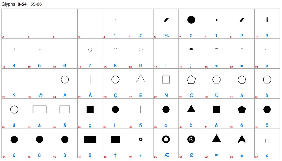
2) glyph selector
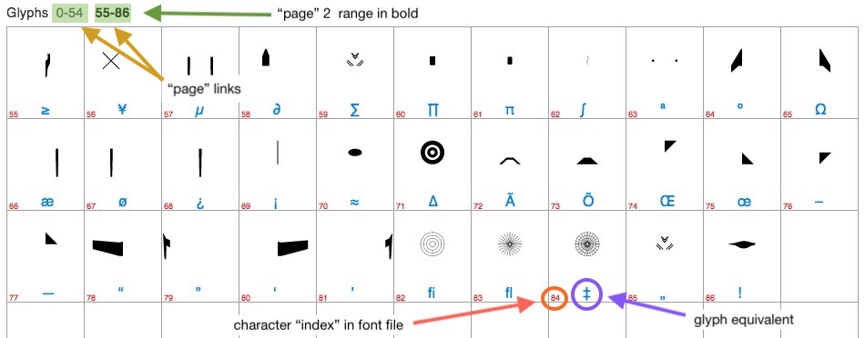
The glyph selector section is every glyph in the font, like a “map” of the font. Only 55 characters at a time are displayed in “pages”. Each of the map pages can be accessed by clicking on the “Glyphs” #-# link. Which page you are on will be highlighted as bold text.
Clicking on a glyph in the glyph selector will display the details of that glyph in the glyph inspector below the glyph selector table.
3) glyph inspector
There are two parts to the glyph inspector, the graphic representation on the left and the data details on the right. OTF fonts will not display the xMin to yMax data points or the rightSideBearing all the time, so do not be concerned about that. All of the fonts available from Sight-Creations will be TTF.
More Info
Fonts are a peculiar entity. You think of them in order, like A, B, C… but that’s not how they are arranged internally. Many fonts created on a PC or in Open Source font creation apps are likely to keep glyph data in “as created” order rather than character code order. It really doesn’t matter, so don’t be upset or confused when you view a font that has all kinds of “unicode space” characters at the beginning of the file and the alphabetic characters are spread all over the place. The Font Inspector displays glyphs in the order they are saved within the font file.
Fonts created for Macintosh use have at least 3 specifically required (and visually blank) characters: the “missing” character (at index 0), the null character (index 1) and a backspace character which is never visible anyway, but occupies a space within the font file. There are occasionally several others and they will all have character codes < 32. For Macs, the first “official” glyph character starts with ‘!’ at character code 33 (not to be confused with the stored index into the font file displayed in the font inspector “table”.) The “space” character is code 32. Fonts created in Fontographer adhere to the Mac encoding scheme for character assignments and ordering within a font file.
The view of each glyph in the inspector:
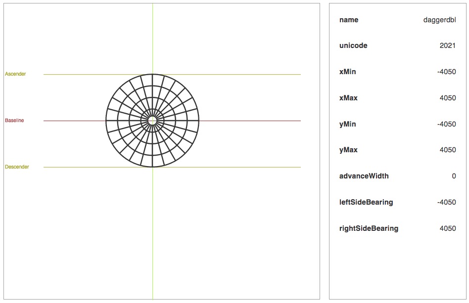
Each glyph is center placed within its rectangle. The index of the glyph in the file (not it’s actual character code!) is in the lower left corner in red. These numbers will always be sequential and their values will fit within the “page span” of glyph numbers, e.g., 0-54 for page one, 55-109 for page two, etc.
At the center bottom, in blue, will be the corresponding character in a “regular” font that corresponds with the equivalent character code of the glyph displayed. For modeling fonts, the display glyph could be any kind of shape. The blue character can act as a guide to accessing that glyph using the keyboard keystroke(s) for the blue character. Example: é is a combination keystroke of option-e + E.
The image below displays the various features of the glyph inspector. There are 55 spaces for glyphs, numbered from 0. The first “page” glyphs are numbered from 0-54 (zero “counts”!) There can be up to 1000 or more glyphs and you navigate the file by clicking on the index ranges displayed. The currently selected “page” is in bold. Each glyph that is present is drawn, more or less centered in the rectangle space, but its visible placement may be dependent on its design [for the ¥ and ∂ characters in the table below, the width is 8000 and the left sidebearings are offset into negative space. The wing-tips at index 78 and 80 are zero width characters offset from the center by their relative visual distance in the character space.]
When a glyph is selected, it is drawn again much larger in the glyph inspector which contains much more information about the character you have selected. Besides the glyph, there are guides. The three horizontal lines are, from bottom to top: the Descender, the Baseline and the Ascender lines. These are “font specific globals” on which all glyphs are placed. In general, glyphs will not be drawn above the Ascender or below the Descender, but there is no absolute rule here. Glyphs will not be cropped to fit within the space if a little overlap is required. (There is a limit how far out of bounds glyphs can be drawn though).
When a glyph is applied to the inspector, one or two vertical lines will also appear. The blue vertical line, if present, represents the “origin” (cursor point) of the glyph. It intersects the Baseline at the “Basepoint”. The green vertical line represents the AdvanceWidth of the character. This is the point at which a cursor is advanced to place the next character when typing. If only one (green) vertical line is shown, then the glyph character is a zero-width character. Zero-width characters are often a great convenience in 3D Modeling as it allows automatic alignment of various zero-width characters with each other or so that the various pieces can be fit together like puzzle pieces simply by typing them – which order you use makes no difference! (No difference with their appearance at any rate. Using behaviors like Sequence Text in Motion will definitely still use the order in which they are placed.)
To the right of the glyph inspector is the relevant data for the active glyph. Some of this data requires some explanation.
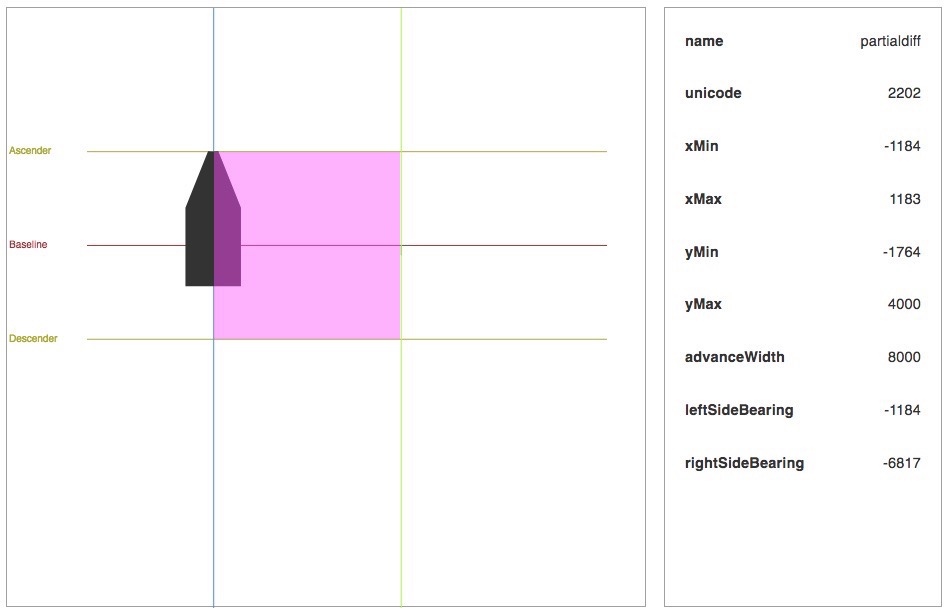
Think of a font as a folder with a bunch of individual vector graphics files inside. There is also a database with information about each vector file built in. Each individual file must be saved with a
name. The name is a standard label for the glyph related to its association with a keyboard “selector” (the key you type to display the glyph). In the image above, the glyph corresponds with the “partialdiff” (partial differential) character (∂), which, in Mac Encoding is character code 182 (not shown) or option-d.
unicode: This value can be used to place glyphs available in any font from your keyboard. Even if you don’t know the keyboard stroke(s) for a specific character, you can use Command-Control-Spacebar to call up the system character viewer. Select the Unicode category in the left column and shortcut into the list with the “block selector” a the right. the 00002200 block corresponds with Mathematical Operators. Selecting the block will shortcut navigation into the list to that block, then find the offset and double click on it to insert it at the current cursor position.
By the early 1990s, as computers were becoming less American-centric, it became apparent that the collection of glyphs was growing very quickly and expanding beyond the 255 standard glyphs originally available. Over the years, Unicode “mapping” has grown to tens of thousands of characters. That does not mean every font must have thousands of glyphs, unicode is simply a method of mapping the available glyphs to various types of keyboards (like Chinese, Indian, etc.) that rely on special language specific glyphs. There are even ranges of unicode dedicated to “dingbat” like characters (images, emoji, etc.), and mathematical symbols, etc. Unicode has been greatly expanded to include many different languages and common symbols and made available from a terminal input (a.k.a. keyboard). Over 1 million character codes have been allocated to the unicode character space.
xMin, xMax, yMin, yMax: These are the minimum and maximum points of a glyph — the “bounding box”.
Fonts are not created in computer space. They have no relation to the screen you are looking at. Their internal dimensions are “abstract” and only apply to a coordinate system inside the font itself. In the early days of font creation (PostScript) the typical Em-Square (the abstract canvas upon which glyph vector points are placed) was 1000. Notice I only stated “1000” because this is only the vertical extent of the character space in the canvas. The horizontal extent is quite flexible, however a perfect square will be 1000 em units high and 1000 em units wide. However, it is quite possible to create a shape that is 1000 em units high by 1777.78 em units wide (or HD aspect!) The Em-square relates to “Line Height”. Overlapping the boundaries is quite possible (and frequently utilized). There is an extra amount of space inherently provided for line gaps for more spacing other than line-height.
In the image above, the em-square space is highlighted in magneta.
Fonts created for 3D Text for 3D modeling in Apple Motion really should have Em-squares much larger than 1000. The Truetype specification begins at about 2048 and can go as far as 8192 in apps like http://icomoon.io/app or http://Glyphter.com. If you are using these resources, dig into the Preferences and make sure you set this value to its maximum (on both sites, anything you set over this 8192 value will be automatically reverted to 8192 — tested!) If you’re using Fontographer, the maximum allowable em-square size is 8000. Other apps may be able to provide more resolution. Motion is relatively “low-poly” so the higher the resolution you can provide, the better quality you will be able to obtain from Motion modeling.
Therefore, the lines drawn (Ascender, Descender, Baseline, Basepoint vertical and AdvanceWidth) all relate to how the glyph in the inspector is placed at the insertion point in an application that accepts input from a keyboard. The glyph’s artist can do anything they want with that space, even go out of bounds (or create glyphs that will not advance the cursor).
The advanceWidth has been described above — it is merely the amount of horizontal distance the cursor will be moved once the current glyph is placed/rendered.
The leftSideBearing is the distance from the basepoint vertical (0-point) that the left edge of the glyph is drawn. This is a tangent absolute value of the leftmost “fill point” (not really a pixel – not to be thought of in terms of computer monitor screens). If this value is positive, the leftmost edge is to the right of the zero point. If negative, it “hangs” left of the zero point. In a common serif typeface, you may find the left edge of serifs will bleed over this line. In other symbols (and “drawings”) this will be an indicator of how far it will overlap with the previously placed glyph.
The rightSideBearing is not part of the Truetype specification, but it is relevant information for our 3D modeling fonts so it has been created after the fact. The rightSideBearing is the distance from the advanceWidth to the right edge of the character. Why is this information important? Along with the leftSideBearing, it will give you accurate information for how the character is placed with respect to the advanceWidth. Although this information is easily obtained by using the xMax value vs the basepoint (zero-width glyphs) or the advanceWidth, I just did the math for you for convenience!
I want to design fonts for 3D models. Do I really need to know all of this?
Nope. Design your font glyphs so that they basically overlay each other in the same space just like old-fashioned cell animation. Be mindful of “center positions” in that space (very important in rotations). Accessory glyphs where alignment isn’t imperative, can have any placement. The main thing you want to avoid in Motion is having to adjust the Anchor point of your model pieces. (There’s a way around this problem for certain types of glyphs, but that’s for another article!) Modeling in Motion is easy!