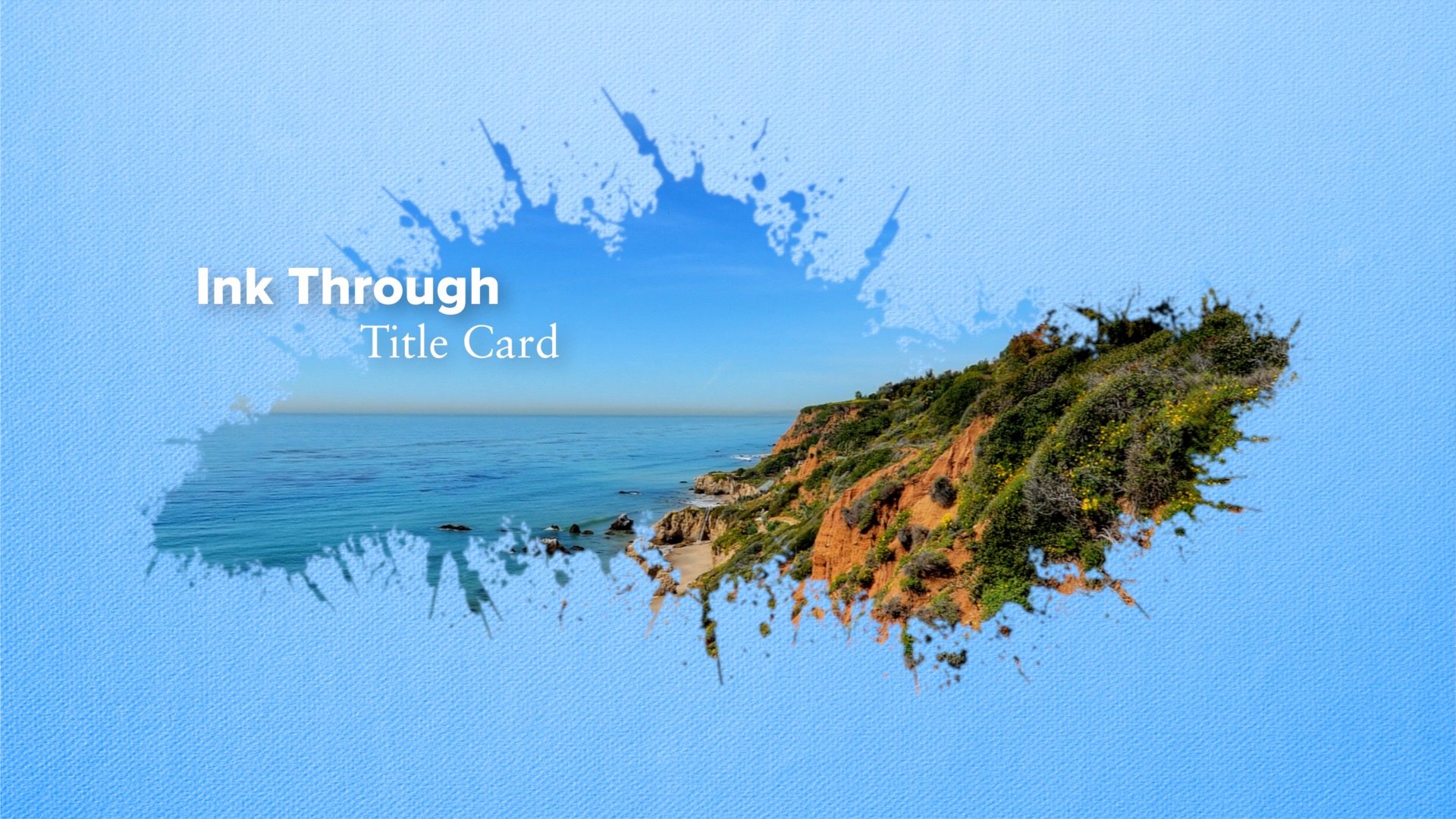
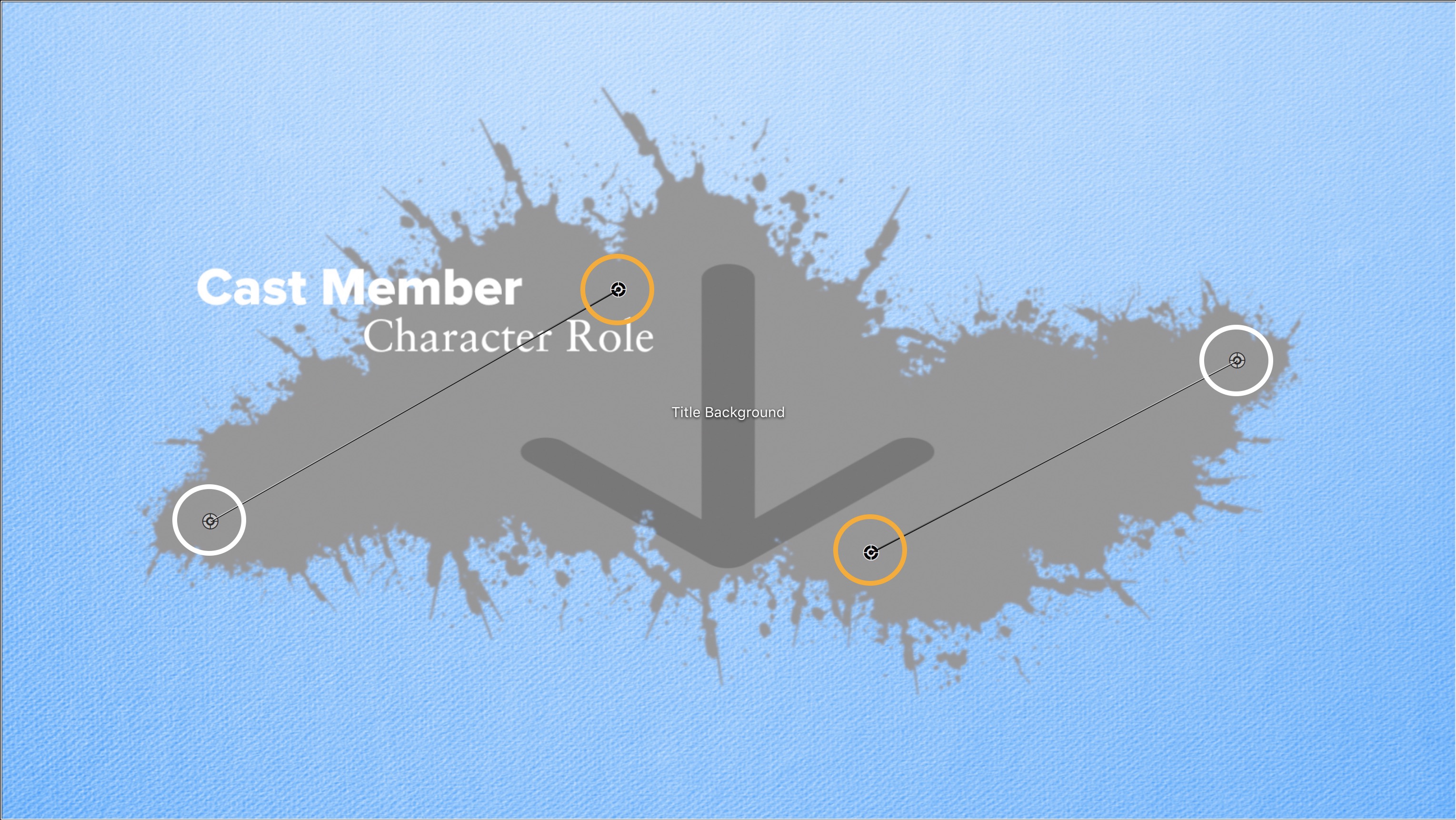
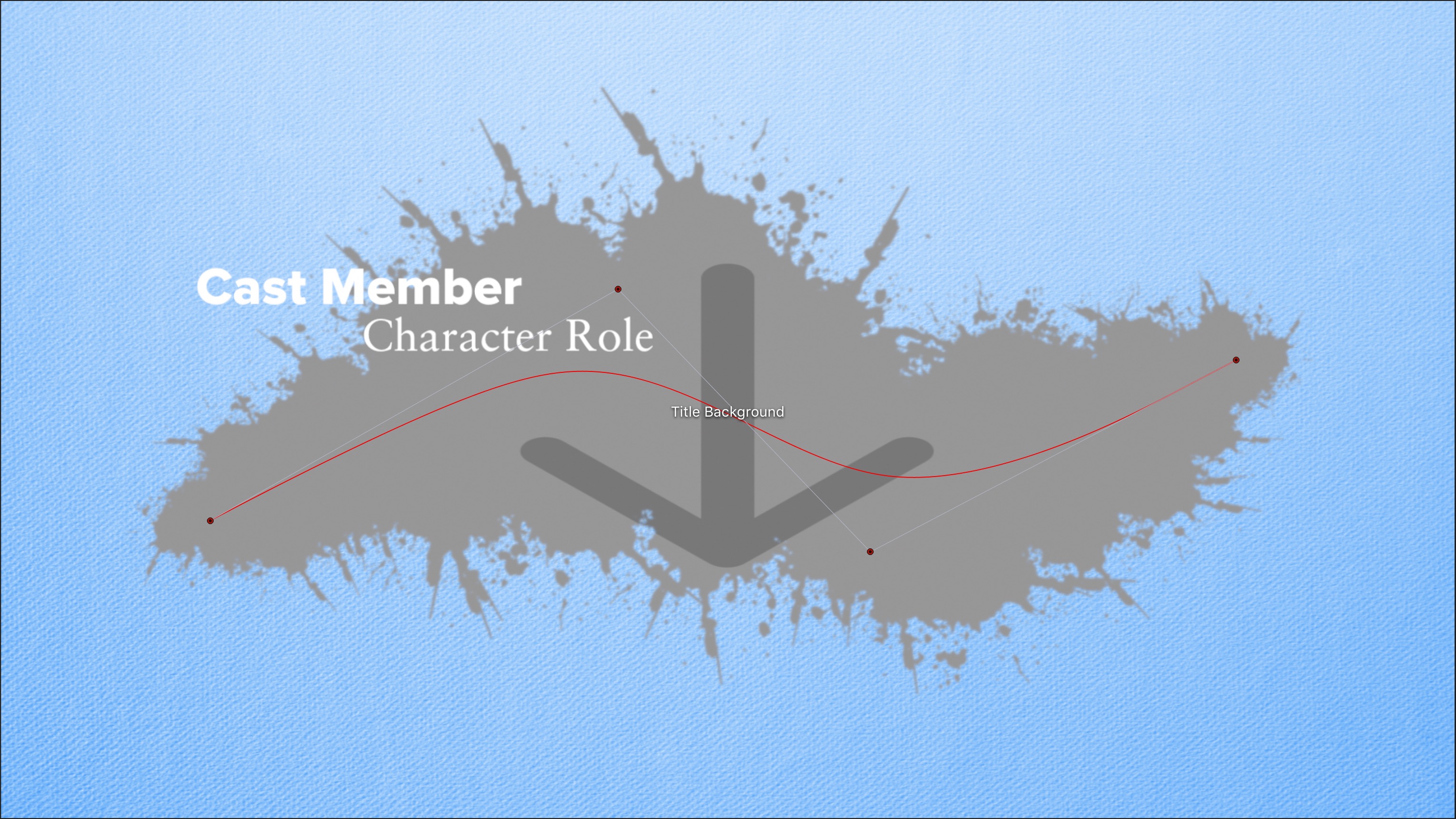
Ink Through is a simple title effect with the possibility of nearly infinite variation. The ink is splattered along a curved line which you can design right on the screen. The provided OnScreen Controls allow you to specify a curved line along which the Ink splatter effect will follow*. There are four controls: two light-grey and two black. The white control the end points; the black control the amount of curvature away from the imaginary straight line between the two white controls.
Ink Through requires the installation of the provided font (ZZSC Ink Through – Regular.ttf) in order to be used in Final Cut Pro X. The reason for this is that specifically designed font purposed for an effect in Final Cut is less likely to ever suffer from font substitution which would damage the effect.
Here are its parameters:
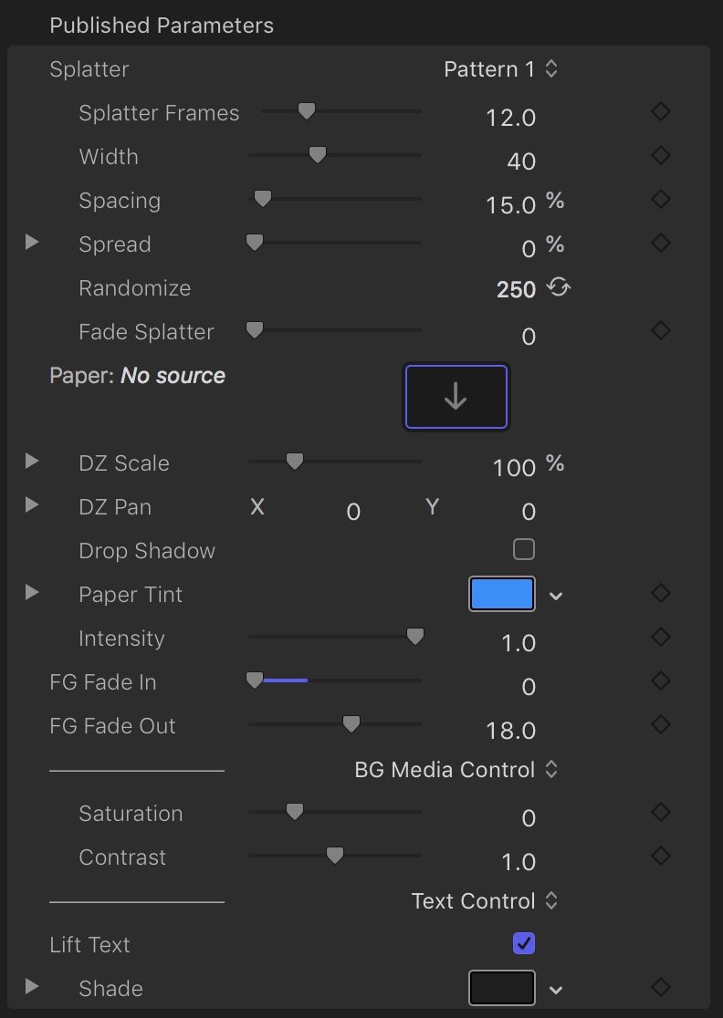
Splatter is a dropdown menu with the option to select 1 of 8 base ink splatter patterns.
Splatter Frames is the number of frames used to “splash” the ink. The range is 0 (instant) to 45, or 1.5 seconds. This title is designed to maintain that time regardless of stretching in the storyline. It is not recommended to shorten the title to less than two and a half seconds (when Splatter Frames is set to its maximum of 45).
Width determines a relative size of the splatters through the middle of the curved line “drawn” on the screen. Ink splatters are designed to start small, widen, then finish small, as if being poured onto the screen.
Spacing determines how many splatters are drawn in sequence. A small spacing (5%) will densely populate the line. A high spacing value will sparsely populate the line and give a more “spotty” look.
Spread moves the ink spots away from the line they were designed to follow. The movement is such that when keyframed over time, the spots looks as if they are moving in liquid. Values go from 0 (no spread) to very high values if you click and drag on the number parameter value in the inspector.
Randomize will rearrange the ink drop pattern on the screen. Click the opposing arrow circle icon to generate a new value (or type in a specific value).
Fade Splatter will alter the amount of mix between the foreground “paper”/image and the background (media on the storyline). 100% will fade the splatter completely leaving whatever image (paper) was used as the foreground.
Paper. By default, this title uses a linen paper texture. This is a pre-filled drop zone. It is possible to replace this default image with any other image or video you prefer. For video, choose the media from the Event Browser or choose a frame from a clip in the storyline (which tends to become a still frame in the drop zone.)
DZ Scale may be used to resize the drop zone media and DZ Pan may be used to reposition the media within the Drop Zone region.
Note: due to the scale of the “paper” texture filling the original drop zone you may experience an enlargement of new media used to replace it. To reset the scale to display the media at its proper size, use the scale value of 79.3% (more accurately: 79.295154%). Using Pan may or may not be necessary to reframe the media correctly (generally not.)
Paper Tint colorizes the image/media to a duotone like appearance based on the
Intensity. A value of 0 will not apply any tint at all while 1.0 will create a full duotone effect. Values in between can be used to create many different pleasing coloring effects.
FG Fade In controls the opacity of the Paper layer. The Fade In value is the number of frames requires to go from 0 to 100% opacity. The range is from 0 (immediately 100% opacity) to 30 (one second in a 30fps project).
FG Fade Out controls the opacity of the Paper layer from 100% to 0% based taking the number of frames designated. However, on the outgoing side of this effect, the timing is not “fixed” and is relative to the length of time stretched title. For an unstretched title (5 second default), the maximum frames to fade out will be 30.
Background Media Controls (Saturation and Contrast)
You have the full arsenal of Color Correction available, however these two features are added for your convenience. Desaturation creates a beautiful faded look and Contrast adjustment to de-emphasize the storyline media or creating sharpened contrast for emphasis. The combination of saturation and contrast work best with the overall effect of this title.
Text Control
Lift Text applies a soft drop shadow that makes the text of the title appear to “lift” from the “paper”. A color is provided to change its appearance from a shadow to any color glow effect. These are option, but turned on by default.
Text color, font, size, and everything else (including 3D text) can be customized from the Text inspector for the selected Title text fields (there are two.) These text fields can be dragged to any location on the screen. Use this capability to arrange the text in, out or across the Ink splatter boundaries. These creative decisions are up to you.
*When editing line points, it will almost always be necessary to move the playhead after changing the position of a control point in order to update the new line drawn on the screen. You may wait until all four have been moved.