
About SC Pie Chart
A generator for Final Cut Pro X
[Note: SC Pie Chart requires the installation of the supplied font: ZZSC Pie Chart Parts.ttf. The effect will not function without it. This is a 3D effect and this font makes that possible. This effect requires Final Cut Pro X 10.4.3 or higher.]
SC Pie Chart has been designed and built as a tool to create pie chart infographics for video. At its core is a specially designed font that takes advantage of features in Apple Motion only available to text and not available to regular vector graphics.
SC Pie Chart adheres to a “best practices” for pie charts: no more than five sections. More than five is considered “tiring” for the viewer. If you have more than five “data points”, consider labeling the fifth as “Other”.
SC Pie Chart has five Data Point text objects to be used for percentages or labeling. Attached to the Data Points are lines. All lines align with the center of the Data Point text on one end and the center of the pie chart (or the vertex of the section characters if a partial chart is used). No matter where you position the pie chart, the lines from the Data Points will follow its “center”. No matter where you drag the Data Points, the lines will align with their centers as well. You can use the Text Inspector controls to change font, size, or any other characteristic of the text used (including 3D Text).
There is also an accessory “Legend” which can be dragged around the screen with an onscreen control or easily hidden if not needed. The color tabs on the legend are automatically taken from the colors of the pie chart segments, so if you do not use all five segments and want to use the legend, you should turn the unused segment colors black to hide them.
There are many parameters available in this effect generator but they should be grouped in a convenient way to make alterations and animations as easy as possible.
Parameters:
As you can see, there are quite a few parameters! Dashed lines are used to create visual separations. Sections are broken down into:
Pie Chart segment/section or “Slice” controls; Appearance controls (position, rotation, scale, etc.); Coloring and 3D “helpers”; Background; and Line segment control for the Data Point “callouts”. As you learn to use this tool, hopefully you’ll find this feature breakdown a convenient way of handling any special effects or animation you would like to accomplish.
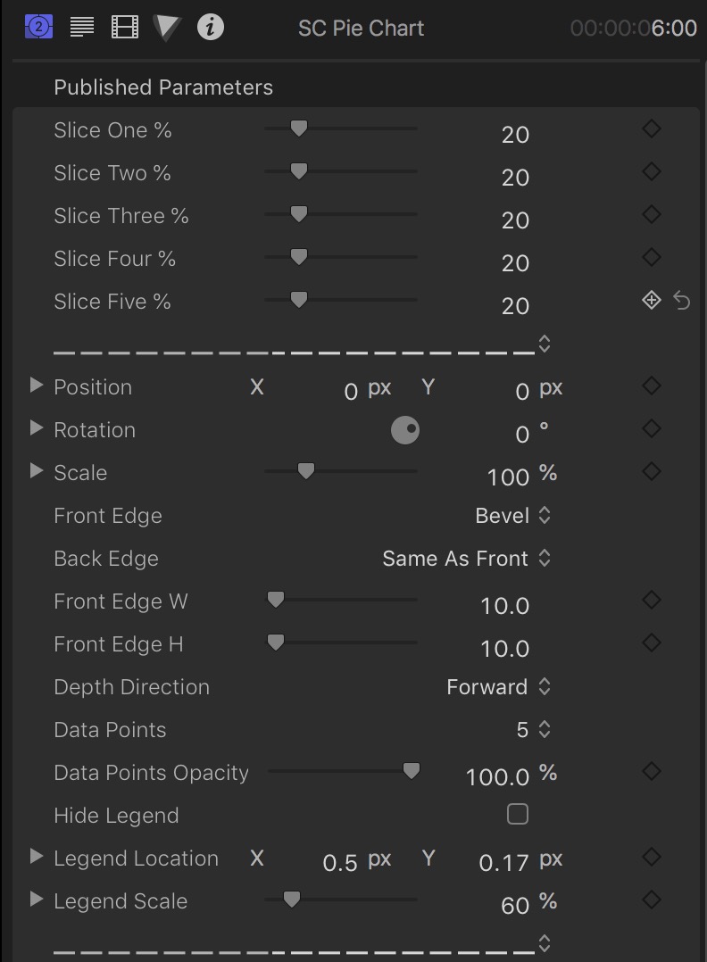
Slice Controls
By default, the Pie Chart is fully active with five 20% slices making up a 100% chart with five different colors: green, yellow, red, blue and cyan. It is possible to grow slices so that their totals will equal more than 100% (but we’ll save that for a special treatment). For this section of the guide, it will be assumed that you want to create charts up to 100% and no further. With that in mind, no matter how many slices you use, when the circle closes, the total of all the used percentages will always be 100%.
Percentages are all whole numbers or integers. There are no fractional values, not even in the inspector! All slices will continue from where the last slice’s edge is positioned, automatically rotated and aligned. How to achieve “gaps” will be outlined below and using different (appearance) parameters than the percentage controls. [Note: animating this arrangement in reverse, i.e., from a higher to lower percentage, may cause minor “separations” between slices due to rounding “errors” in the calculations behind the scenes — if this bothers you: don’t do it.]
SC Pie Chart “slices” are not shapes, they are font characters. There are 101 characters: a “blank” character (not really blank, but one character used as a place holder) and 100 wedge shaped characters each representing percentages of a circle (in 3.6º increments) progressively expanding until a perfect circle character at the end. For this reason, there are no fractional percentages used. If you label your data points with fractional percentages, you will need to make sure all your values add up to 100% on your own.
Appearance Controls
Position, Rotation and Scale in this section deal with the actual Pie Chart graphics. They have a drop down control to reveal more parameters, perhaps the most important of these will be Rotation. Dialing down the disclosure triangle will reveal the X (up/down) and Y (left/right) rotations along with the obvious and default Z rotation (spin around center). You can use Position Z to create the appearance of scaling (closer/further away) but it is not as efficient as using the Scale parameter provided for resizing in the Viewer. Similarly, using Scale.X/Scale.Y is not very practical, but some use could be found using Scale.Z, otherwise, simply using the main Scale control is the recommendation.
The next five parameters deal with the overall appearance of the individual slices and concern how the Edges are formed and how the pieces match together.
Front Edge and Back Edge
3D Text can have several different “transitions” from the sides to the front (and back). The default for this effect is Bevel for the front and “Same as Front” for the Back (so both sides are the same.) The other options are:
Square: No displacements and Front Edge W/Front Edge H have no effect.
Round: Corners rounded by Front Edge W and Front Edge H. If either of these is 0, there is no effect.
Bevel: Same as Round only a straight line “indent”.
Concave: The corner edge is “scooped” by Front Edge W and Front Edge H. Same rules for 0’s.
Ridge: The edge is separate from the Front or Back surface and raised to create a “wall”.
Square Ring: Square Ring removes the “facing” surface (Front or Back or Both) and is similar to Ridge. Only Front Edge W has an effect.
This effect is set up for control over the Front Edge only. Both front and back will behave the same only when Same As Front is selected for the Back Edge. Otherwise, you can individually select the various edges for the back, but they will be limited to the default 10×10 Width and Height parameters.
Depth Direction allows you to align the pie slices along the back edge (Forward) or through their depth centers (Centered).
The rest of the Appearance section regard the text options available.
The Data Points parameter allows you to select how many slices you need text for. It doesn’t matter if you use slice 1, 3 and 5 because all of the Data Point texts can be dragged anywhere on the screen and their corresponding lines will always point to the center point of the Pie Chart. This makes it very easy to set up any text for any slice anywhere around the pie.
Data Points Opacity allows you to fade in/out texts used at any point.
In the demo video (linked below) there are Data Points appearing after a slice animation. How this is accomplished is that pie chart is completely laid out, texts included. For each pie slice, a length of time is chosen and bladed. Enough time is allowed for the slice animation and turning on the text and giving the user enough time to realize the action. The animation of % is keyframed, then bladed on the next frame or so. For the early side, the text is turned off, and for the other side, it’s turned on (using the Data Points menu option).
Legend is perhaps the least important aspect of this effect, but provided for completeness. There is a checkbox to Hide the Legend. Unchecking this option will show the Legend. There is an OnScreen Control for positioning the Legend (and its parameters can be keyframed to animate it) and a parameter to Scale it for legibility.
Legend “tag” colors are taken automatically from the pie slices. If you need to conceal colors for unused slices, set the corresponding color to black and you can select the texts and substitute space characters (this keeps the onscreen text boxes from disappearing altogether if you need to go back and add text later.)
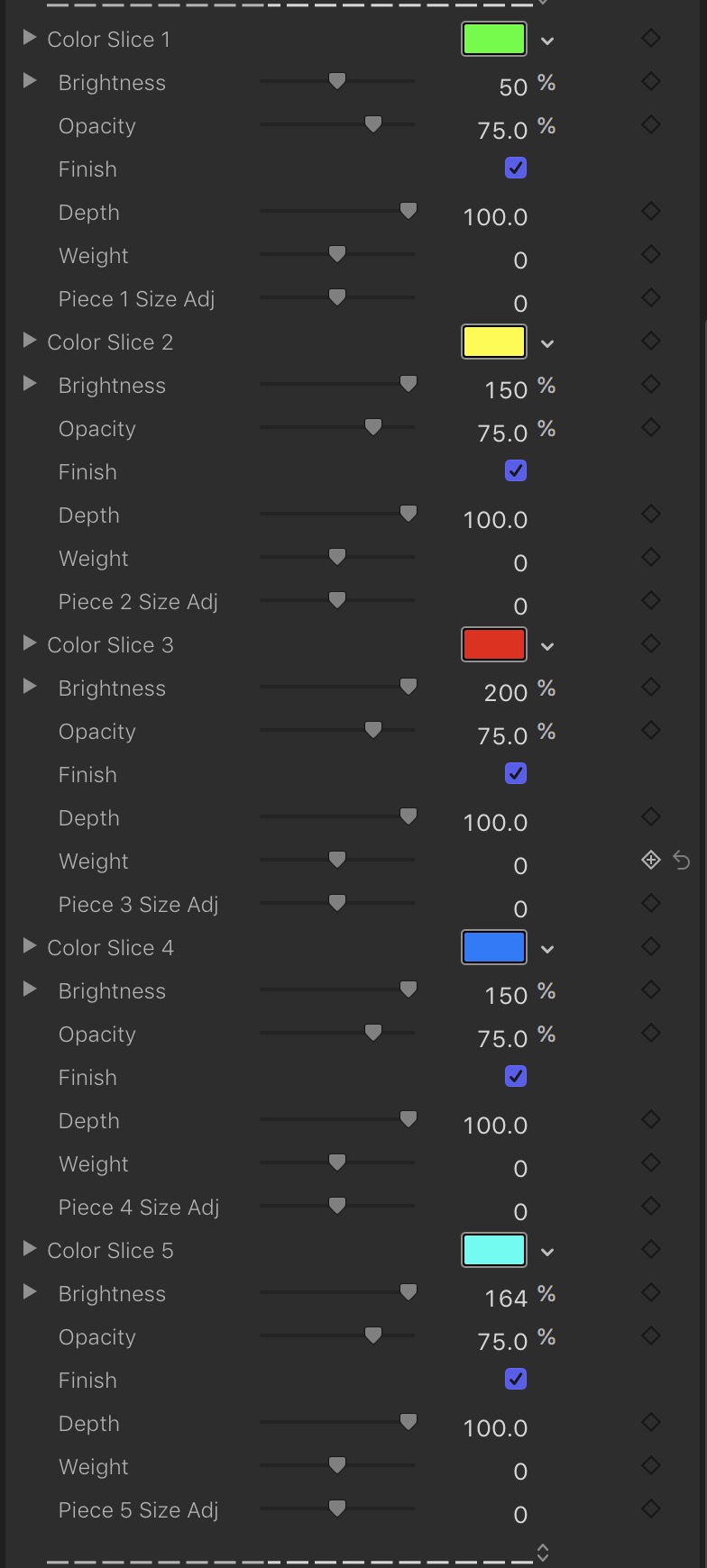
Coloring and 3D Helpers
This section contains exactly the same options for each of the five available slices and for each, the Color Slice # option is the first of the group making it easy to “mark” which group of parameters that need to be dealt with for a particular slice.
Brightness: This is a 3D Text option that allows you to intensify a color without having to repick a Hue. This will come in real handy in pie charts where all the hues are the same but the brighnesses (or shades) create the difference. You can click on the number value and drag it up very high to make the colors very intense, and if you use a low opacity, then you will be able to reestablish lighter colors as the transparency becomes greater.
Opacity: The transparency of the slice. Can be used to fade in slices instead of animating the % controls or create other effects with the 3D parts.
Finish: This parameter, on by default, adds a bit of a “shine” to the shape surfaces. Turn this off for a more “matte” look.
Depth: This control is applied individually to each slice (different than the edge appearance parameters) and can be used to great effect in 3D perspectives.
Weight: This is an interesting parameter. This parameter allows you to reduce the *size* of the slice without scaling the size (there is a difference!) Reducing the Weight will cause all edges of the shape to retract towards its “gravitational” center (not it’s actual center point, which is the *vertex* of the slice shape.) Use this in conjunction with:
Piece # Size Adj: This parameter will add or subtract 400 points from the default point size of the font used (which is ~800). The unique property of this parameter is that it will alter the size of the font character without changing how it fits in its allotted position within the Pie structure. Used with Weight, it is very effective in creating an Accented Piece effect separate, apart and larger than the other character shapes.
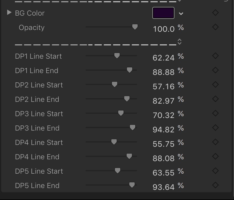
Background
There are only two parameters for the background: The BG Color and its Opacity. You can set these to anything you like to help with overlays in your video, or set the Opacity to 0, use a solid color generator or video background. It is also effective to use the FCPX > Effects > Drop Shadow effect (with perspective) with this generator when the background is transparent.
Lines
Each line has a Line Start and a Line End. The Line Start of a line is the Pie Chart piece vertex (center of the “pie”) and the Line End is the (default) center of the Text as prepared for this generator. You are allowed to set the Data Point font(s) to any font you prefer, and any size you prefer, even use 3D Text if you prefer. Any option available from the Text Inspector is available to the Data Point texts. To assist in placing these available lines with the Data Point texts, it is allowed to use the Text Alignment options (left, center, right). Center text is the default. For larger font sizes, you can “correct” for text center by offsetting the Baseline parameter to get a good match for center and this may be particularly useful in the case of multiline Data Point texts!!
These parameters are available because you will almost never want the line ends to go all the way to the pie center or cross into the text character regions as legibility will be adversely affected.
You can make lines “disappear” by simply dragging the Start or End parameter to greater than or less than the opposite end point control. Example: dragging DP1 Line Start to 100% or DP1 Line End to 0% will remove it from view.