Intertitle 3
An Art Deco . Silver Screen . Silent Era . Retro . Device
Intertitle 3 has been designed as an FCPX generator. It includes the ability to display an image or a video clip in the card’s texture. There are two separate text items, one for a “production” title and the other (“dialog”) as a formattable text edit field. Both text items have the full accessibility to the Text Inspector controls. For the dialog text, there is also an option to Shrink the text to the boundaries of the Text Edit onscreen control. Included is also an optional separator/divider.
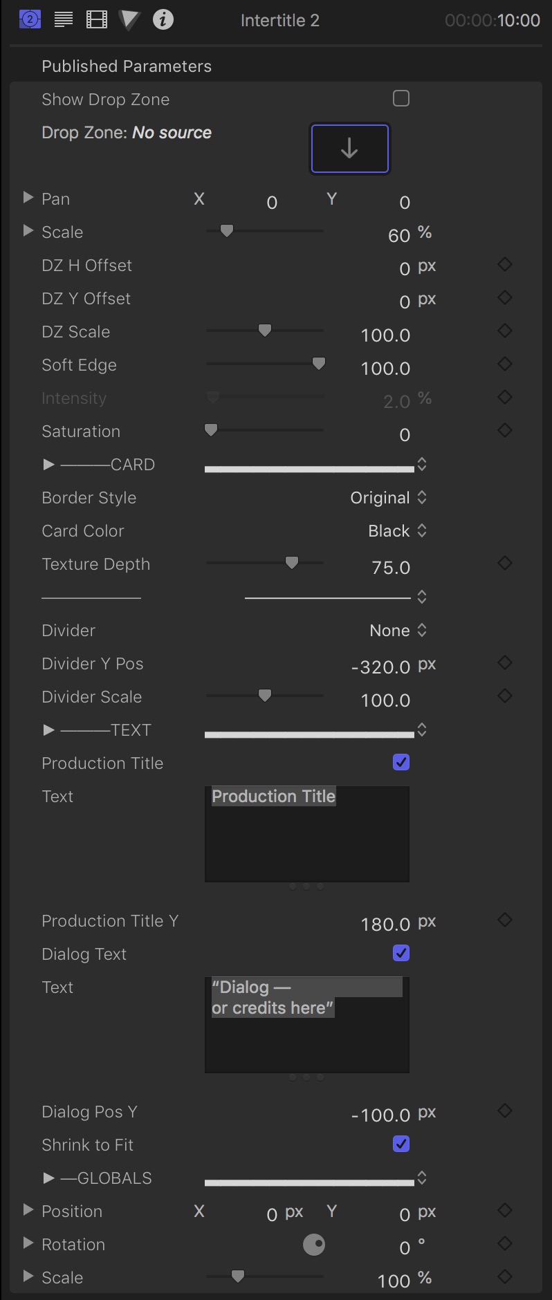
There are four main sections of the parameters available for this plugin. The first section deals with the Drop Zone. The second section deals with the features of the title “card”. The third section deals with the text items and the last section are card “globals” for optional animation.
Parameters:
Show Drop Zone: Off by default. Use this option to turn on access to the drop zone feature. Drop Zones can also be “turned off” by setting the Intensity parameter to 0% (see below).
Drop Zone: Standard drop zone.
Pan will position the dropped media within its container. This is different than the DZ H Offset/DZ V Offset controls below.
Scale will scale the dropped media within its container.
DZ H Offset will move the drop zone within the surface of the Intertitle Card.
DZ V Offset will move the drop zone within the surface of the Intertitle Card.
DZ Scale will change the size of the drop zone within the surface of the Intertitle Card. Its range is limited to 50% to 150%.
Soft Edge: applies a feather to the edge of the drop zone. This only works well if the media fills the entire drop zone.
Intensity: this parameter is turned off when Show Drop Zone is also off. By default, Intensity is set to 2%. Use this control to brighten the drop zone media.
Saturation: by default, the saturation is set to 0% (monochrome). It is possible to set it all the way up to 200%. Be careful not to overblow the color.
Border Style: a drop down menu to select the various borders available, or “None” if you like.
Card Color: By default, the card is set to a very dark gray (basically black). Other options are a slight tint of the following colors: Brown, Green, Cyan, Blue and Magenta.
Texture Depth allows you to control the card texture. It is possible to create a smooth surface. The default is 75. The best range for actual texture is between 25 and 75.
The thin divider in this section separates the (ironically enough) Divider section. The “divider”, if used, is always centered.
Divider is a drop down menu listing the choices.
Divider Y Pos will allow you to position the divider vertically (centered) in the card.
Divider Scale will allow you to resize the divider to fit the text used.
Production Title is the name of the top text. You can toggle it on or off with this checkbox option. It is a regular text item designed to be a label. It’s default font is set to Zingende (available to all users of FCPX) which is a fairly decent Art Deco font (all caps).
The Text box is the Production title text. It is in the inspector for your convenience, however, the text itself can be edited in the Viewer. All other aspects of it can be changed in the Text Inspector.
Production Title Y can be used to reposition the text along the Y axis (relative to either its default position or from the position to which you have moved it to.)
Dialog Text is a second text entry. You can toggle its visibility with this checkbox.
The text box that follows is available for your convenience
Dialog Pos Y: The Dialog Text is centered in the card by default, but you have complete control over its boundaries (left, right, top and bottom). This parameter can control the vertical positioning of the entire text object.
Shrink to Fit can be toggled with this checkbox. Shrink to Fit will force whatever you type in the Dialog Text entry to the boundaries of the Layout.
These consist of Position, Rotation and Scale. These parameters control the appearance of the entire effect. These parameters can be keyframed to animate the card in 3D Space. If you are not familiar or comfortable with keyframe animation, these parameters should generally be ignored. They can be used to set a static position and/or orientation.
Both text objects: you can click on the text once to reveal the 3D text orientation control and manipulate it on the screen, however, it is set by default to the center of the card.
Both Texts can be edited in the Viewer.
Dialog Text is in “Paragraph Layout” which provides an onscreen control (a ruler is displayed over the top of the text; right-clicking on the ruler will allow you to set Tab position to assist you in more complicated formatting requirements [*if the ruler does not appear, look for the small ruler icon at the top right corner of the viewer and click it to turn it on.]
In general, when two text objects overlap in the viewer, one will prevent the other from being accessible. The Production title is on top over the Dialog Text. The Dialog text has the paragraph onscreen control making it accessible anywhere outside the range of the Production title, so that should make it easily selectable. If there is a conflict, use the Production Pos Y or Dialog Pos Y parameters to move one out of the way of the other. Use the same parameter to restore the original position after edits are made.