
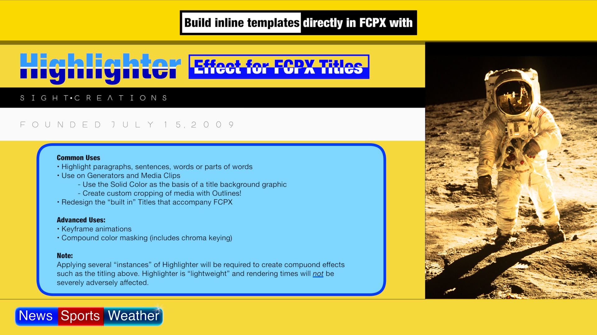
Highlighter 2 User Guide
On the road to creating a basic Text Background feature to highlight text, I unleashed a powerful tool that can do so much more.
Most templates that provide for text highlighting with background color are part of a separate title that has to be loaded specifically. The highlighting is automatic, but what if you just need it for one word? How do you mix titles?
With Highlighter, you can highlight any word. A whole sentence. An entire paragraph or more. You can animate the highlight to span an entire sentence and reduce it to a target word. You can even use it to reveal a question mark from a period.
At its most basic, Highlighter is simply a Rectangle shape (by default). It has two on-screen controls (OSCs). There is a Top Left control and a Lower Right control. Performance is extremely fast. When used in a Title, the rectangle shape will appear to be behind the Text. It’s default blend mode is Overlay. Without a background source* the blend mode will appear to be completely solid against media in the storyline.
* Title templates are designed in Apple Motion. One of the options for a Title template is the inclusion of a background source which is essentially a copy of whatever is in the FCPX storyline plus whatever is included between the storyline and the title if you have objects stacked up. Effects applied to a Title with a background source creates an interaction between the text and its background. The Basic Title has no background source element. It is only the text and there is no interaction with any media between it and the storyline.
Many of the blend modes will appear to behave the same as each other in a Basic Title. Normal blend mode will cover the text. You can use Normal to color the text by selecting the Flip Opacity option. Blend modes, however, will interact with other as you add more and more instances of Highlighter. You are able to keep layering on Highlighter to create very complex effects. Typically, when creating a multi-layered effect, adding one last layer with Stencil Alpha (or Stencil Luma) to restrict the combined effects to a specific final shape.
Highlighter has been designed to create an Outline to any given layer as a separate element allowing for feathering of the fill portion. Outlines also have their own blend mode (although a truncated selection.)
Highlighter can be applied to Generators to build a background template. For example, use a Solid Color generator and apply as many Highlighters as you need to create a framework design for “Title cards” as you might see for Sports player stats. This includes applying cutouts that can be used to change content under the generator to display a photo or scene.
Highlighter can be applied to video clips to create rounded corner crops, or design a title background template, with cutouts that can be saved as Effects Presets.
Highlighter can be used to Key out multiple colors from a single clip. Simply apply as many Highlighter effects as you need for each color. A magical thing happens when you set the Fill Blend Mode to Stencil or Silhouette (alpha or luma) and apply Effects Masks from Highlighter to your clips. Highlighter can be used as a green or blue screen keyer. It will, however, probably require an “assist” from a spill suppression effect (SC KeyFX Spill Suppression recommended!)
Add a basic title. The basic title has no “Source” layer. The source layer is basically a copy of whatever is in the storyline. If a title has a source layer, then text effects are able to interact with the background media. With no source, there is no interaction between the title and the storyline media. This difference affects the way Highlighter will work in some titles.
Add Highlighter to the Title:
When working with objects with OnScreen Controls mixed with Text in the viewer, you need to change the cursor control. The default is (A) the Select Tool. You can change the tool to (B) Blade tool, (H) Hand tool, (P) Position tool, (R) Range Tool, or the (T) Trim tool. These are all valid tools that will allow you direct access to the OSCs in the viewer regardless of the position of the Text object.
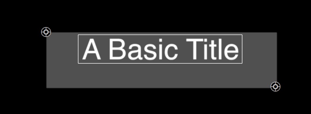
The Highlighter effect is placed in the center of the viewer with a default rectangle shape. Its OSCs are at the TopLeft and BottomRight corners.
Simply drag the OSCs to enclose the region you want. Notice that the shape appears to the background of the text. That is the effect of the default Overlay blend mode. Explore the Blend Mode variations.
For titles with no background source, some blend modes may not look like they’re behaving any differently than some or most of the others. This is to be expected. For titles *with* a background source, some functions of Highlighter will change… considerably!
The basic application of Highlighter will work very much like colored closed captioning.
Highlighter sports an Outline feature that is separate from the basic shape. The Fill and the Outline can have separate blend modes.
First, have a look at the available parameters:
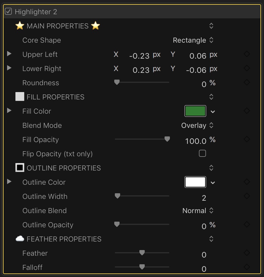
Core shape: Rectangle or Circle/Oval — at first look, there’s no difference. The Circle is set up to be a rectangle. Applying Roundness changes the Circle to an oval and creates a Rounded Rectangle for the rectangle shape. There is a significant difference!
Position of OSCs — Upper Left/Lower Right — These are fast working OnScreen Controls. The published parameters can be keyframed to animate the Highlighter across the screen, typically to pass “under” the Title text to end up highlighting a single word… but, don’t limit yourself to this mundane task. Underlining is also a possibility.
Roundness — described with the Core Shape parameter.
Fill Properties (Divider to separate parameter sets).
Fill Color — The base color of the Highlighter shape.
Blend Mode — Set to Overlay by default. You should have a passing familiarity with Blend Modes. If you’ve ever used a photo editing application, you should. In Highlighter, the Blend Mode will behave differently depending on your application. For the Basic Title, many of the modes will behave exactly the same as Overlay because there is not applicable background for the Highlighter color to blend with. You will have to experiment with the Blend Modes in media clips and generators and titles with backgrounds. The full complement of modes is provided. Stencil and Silhouette will have very special purposes for the more advanced user.
Fill Opacity — should be relatively self-explanatory.
Flip Opacity (txt only) — This one is difficult to explain. In a Basic Title, if you apply this option, the color region will fill the text instead of display behind the text. This will also have an effect in certain circumstances in video clips…
Outline properties (Divider label)
This effect maintains a separate Outline feature with separate blend modes (not a complete set). Outline can be used separately from the fill (that is: you can turn off the fill and only use the outline.) If you Feather the Fill shape, the outline will be applied as a separate shape.
Outline Color — self-explanatory.
Outline Width — self-explanatory.
Outline Blend — This is a shortened selection of blend modes.
Outline Opacity — self-explanatory.
Feather Properties (Divider label)
Feather — feathering blurs the edges. A positive value blurs the shape outward (making it larger). A negative value blurs the shape inward.
Falloff — this parameter can trim up the feathering blur.
Feather and Falloff sliders will max out, but the value can be increased (or decreased) further by clicking on the value and dragging up or down.
Recipes
Creating a News bug:
Add a Basic Title and change the text to News Sports Weather with a couple of spaces between each word.
For each word, add a Highlighter effect.
Type B,R,T,H,or P keys to change the cursor from Select mode.
Drag the OSCs to highlight each word. It doesn’t have to be that neat – just match up the parts that touch each other.
Apply a different color for each section.
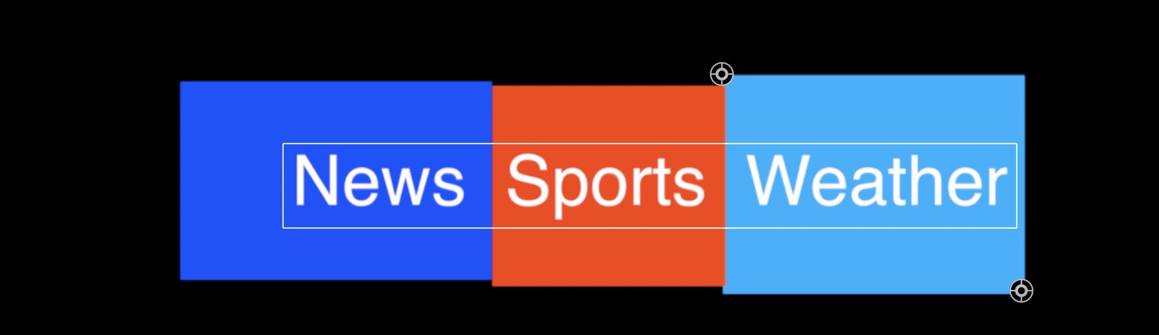
Apply *another* Highlighter. Set the Blend Mode to Stencil Alpha and position the OSCs to create the outer bounds of your graphic.
Set the Roundness to 28%.

Increase the Outline Opacity to about 25% and the Outline Width to about 3.
Add *another* Highlighter. Set the Blend Mode to Color Burn. Darken the grey value to about 0.4. Dial down the Fill Opacity to 68%.
Set the Outline width to 8 and the Outline blend to 55%.
Set the Roundness to 28%.
Apply the Highlighter Spark to the upper right corner at the start of the curve.
You should get something like:

You can go back and adjust the color values to “pull” the effect. Try to keep that deep plastic look throughout the bug.
Creating a cellphone/tablet effect
To a video clip, add Highlighter. This first layer will be the cropped video. Set the bounds of the Highlighter to the cropped area you want to have visible. This will be the “screen” area of the cellphone/tablet device. Set the Blend Mode to Stencil Alpha.
Add another Highlighter. This layer will be the color region around the “screen” or the body of the device. Drag the OSCs out to provide enough coverage for your chosen color. Set the Blend Mode to Behind.
Add another Highlighter. This layer will set the outer form of the illustrated device. Set the bounds to the final shape of the device. Set the Roundness for the corners (approximately 66%). Set the Blend Mode to Stencil Alpha. For this step, set the Outline Opacity to 100%.
As an extra added “touch”, go back to the first layer Highlighter and set the Outline Width to about 8 and the Outline Opacity to about 30%. This will give a little bit of depth around the screen area (the illusion of a layer of glass).
The Highlighter download contains three saved Effects Presets that you can study:
The two other free effects presets. These should be applied to video or image clips. The clip is the source for the “model” screens.
A sample of the wide spectrum of effects that can be created with Highlighter.
The Highlighter download contains another Effect called Highlighter Scale Rotation. With this effect, when added *before* the Highlighter layers can be used to Position, Rotate and/or Scale the media clip’s content within the designed element. Add after the Highlighter layers to position, rotate and/or scale the entire effect. This effect can be used both before and after the Highlighter layers to compound the effect — rotate the video clip in the design and rotate the entire design in the viewer. The video to the right demonstrates this feature.
Keep up to date with Sight-Creations on Twitter.
A good place to see all of my effects as well as several tutorials and other demonstrations in use is on my YouTube channel.
Highlighter 2 User Guide